Graphic designer, illustrator, and digital artist.
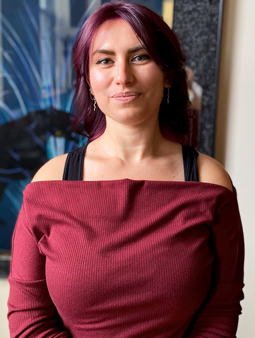
Aleesha is a digital artist based in New England, specializing in design, illustration, and digital art.Creativity has been a constant influence in Aleesha's life, and her journey into the professional art world began during her studies in Digital Media and Design at the University of Connecticut.Aleesha is currently a full-time logo production artist, but in her free time, pulls influence from a wide variety of subjects to create personal projects.
Learn about the process and work behind each of my projects by clicking or tapping the images below.

Pecan's Pantry
Sunshine Select

Panda PC

Rudtym Industries
Sweet Dream Streams

Devils and Dice

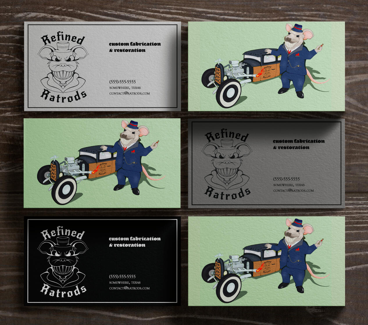
Refined Ratrods

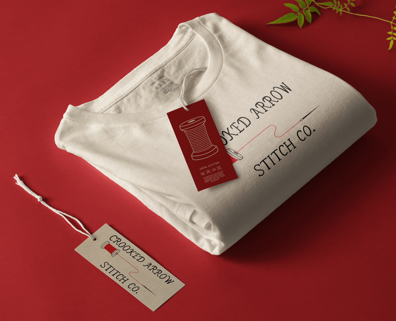
Crooked Arrow Stitch Co.
© Aleesha Lindstrom 2020-2026 | All Rights Reserved
Project Overview: Pecan's Pantry
Objective
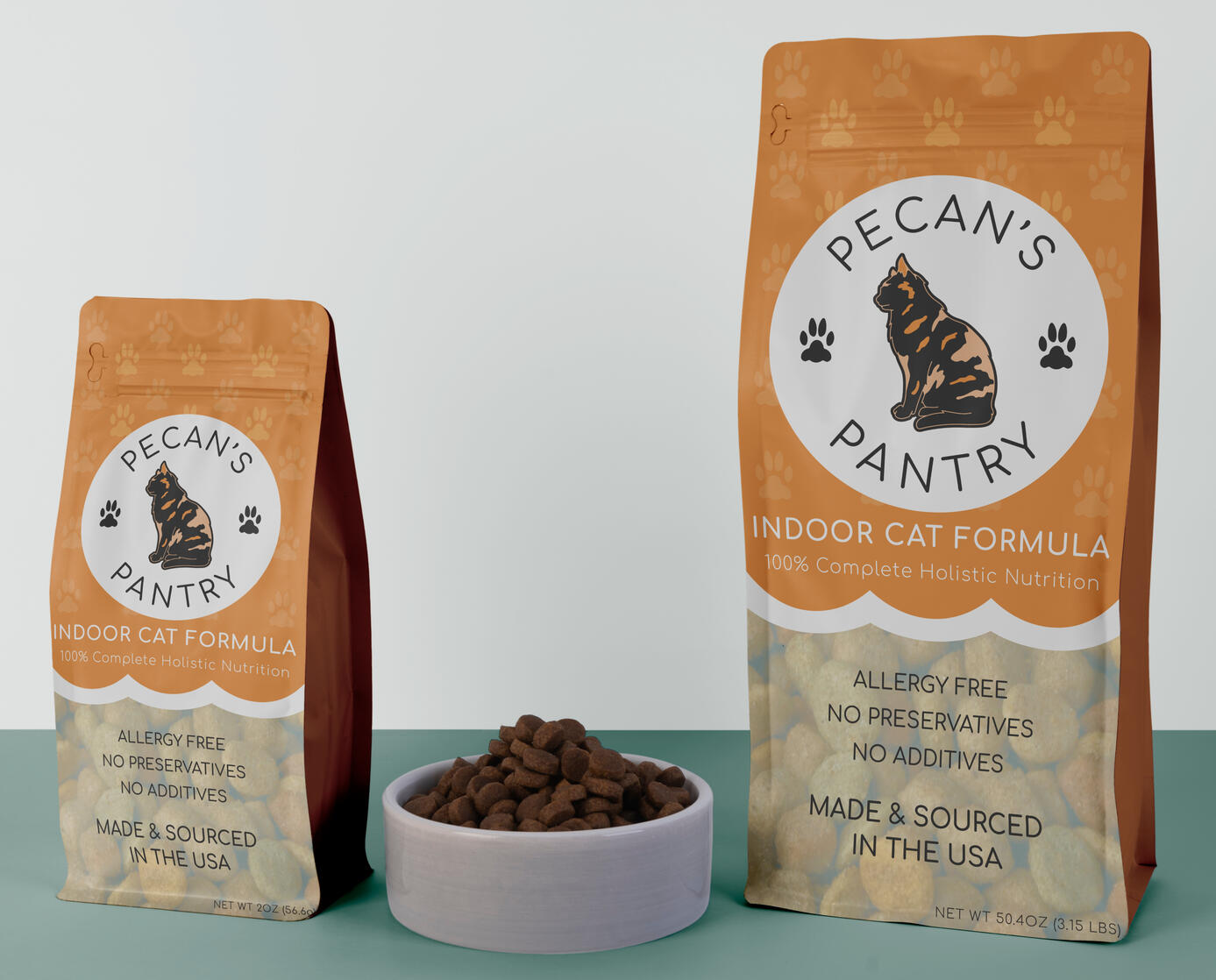
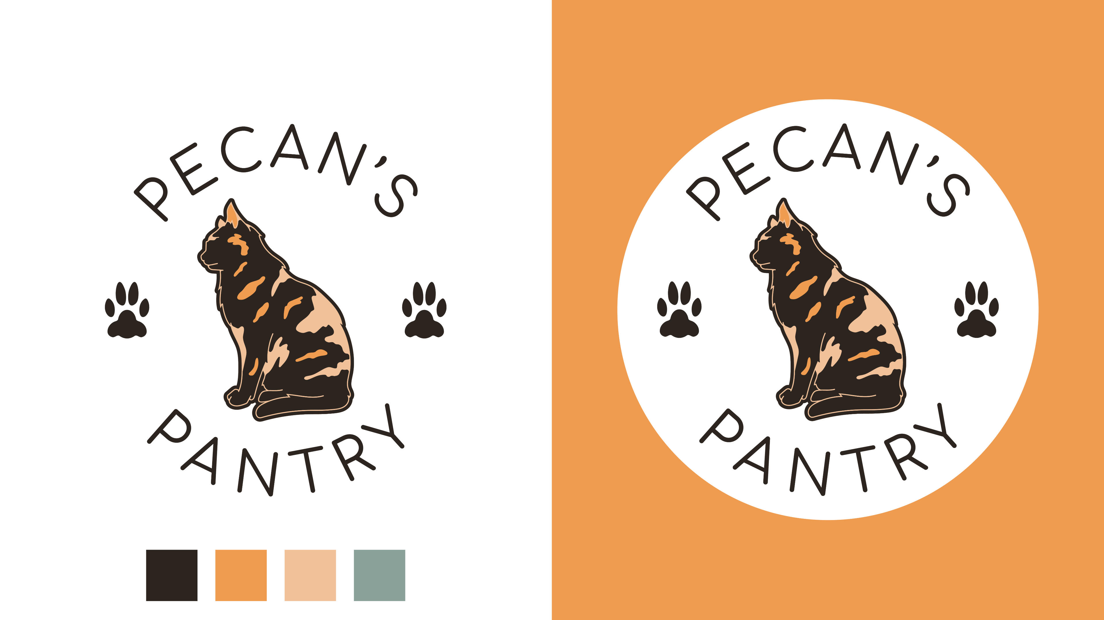
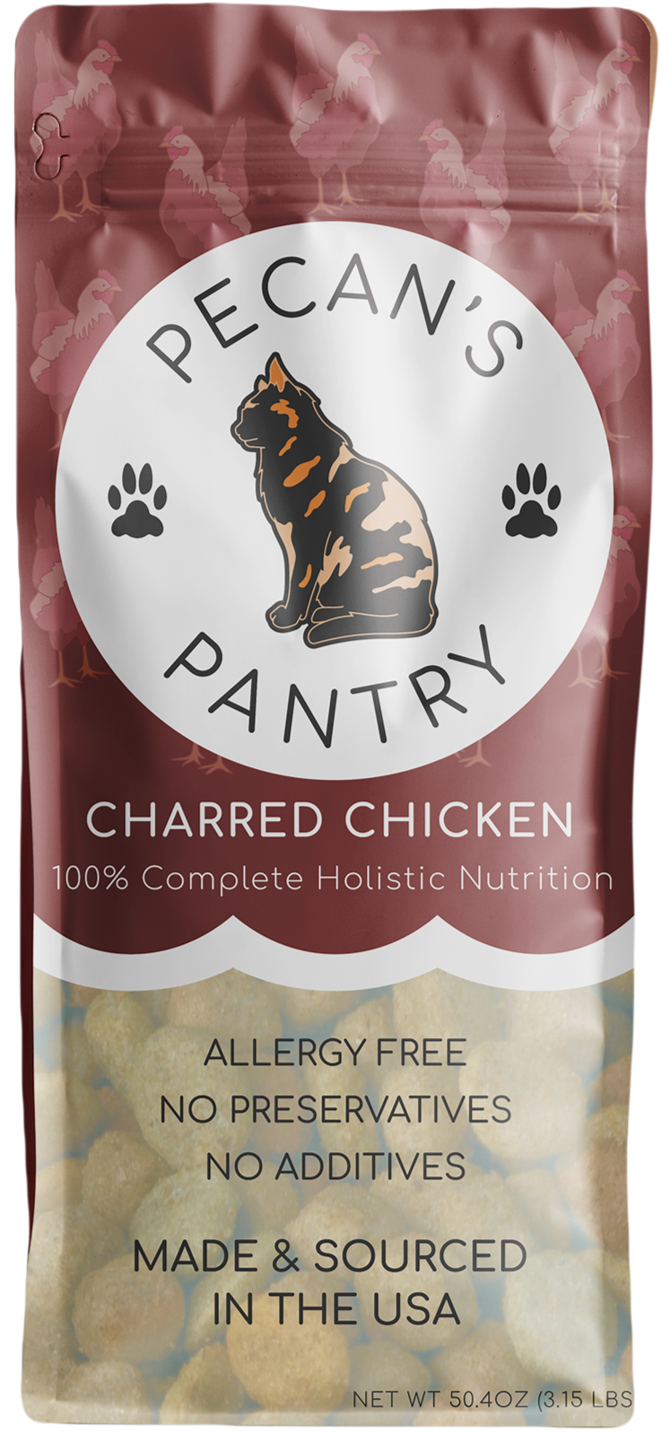
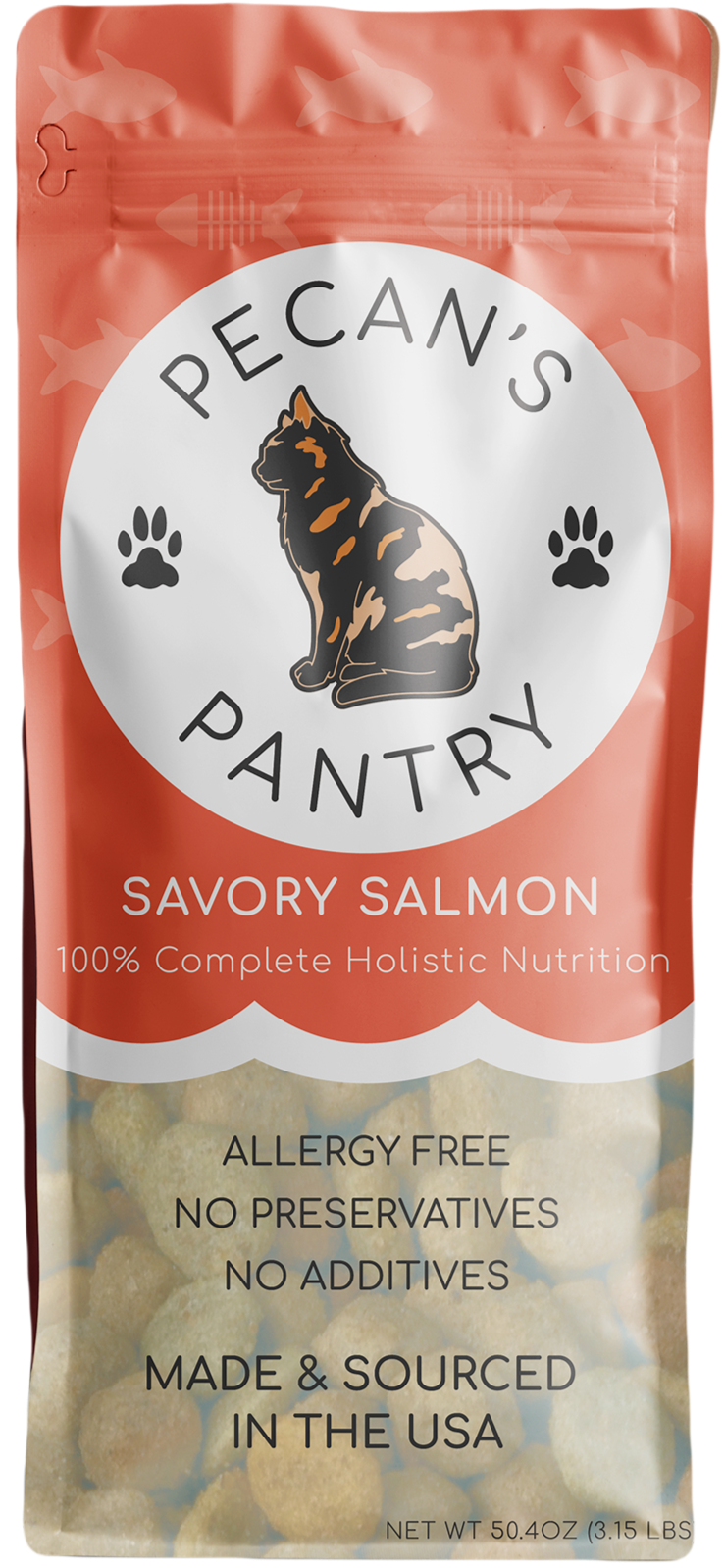
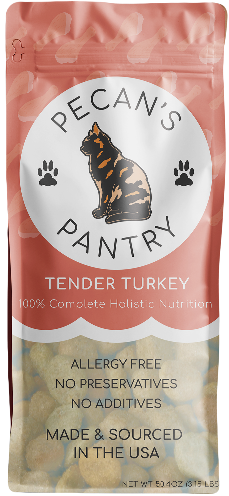
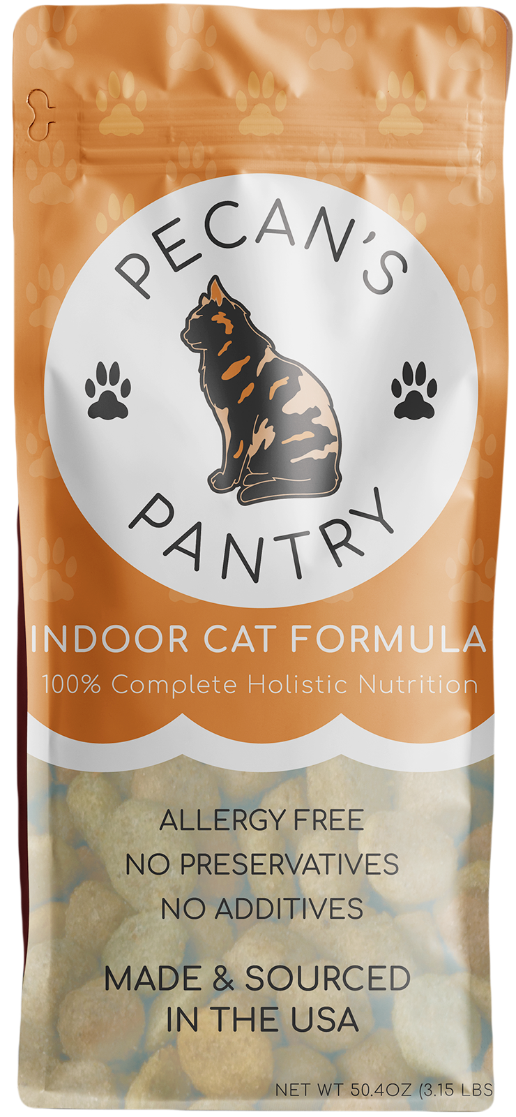
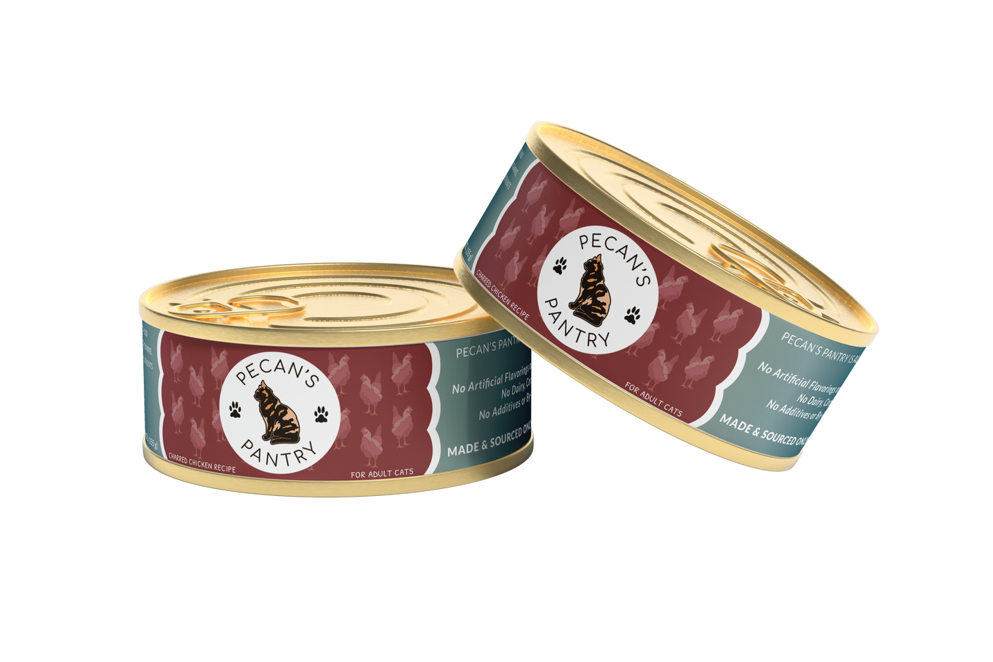
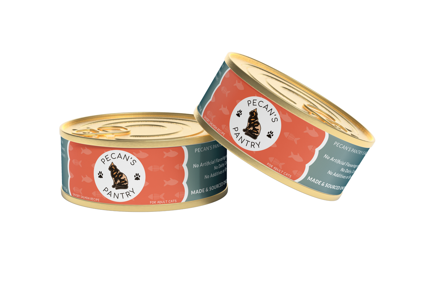
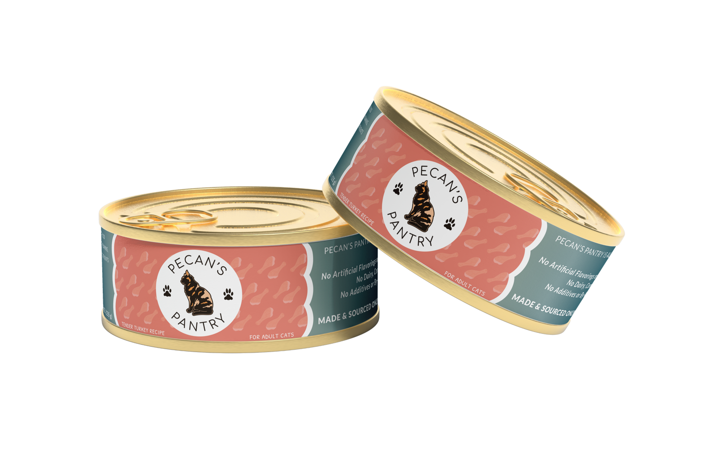
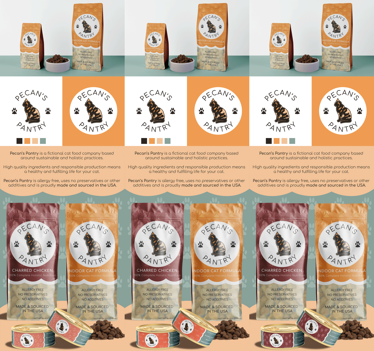
Create a complete brand identity and packaging layout for Pecan's Pantry, a contemporary cat food brand. The brand communicates playfulness with a sense of quality.
Visual Elements
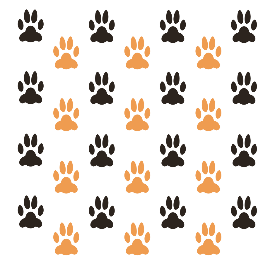
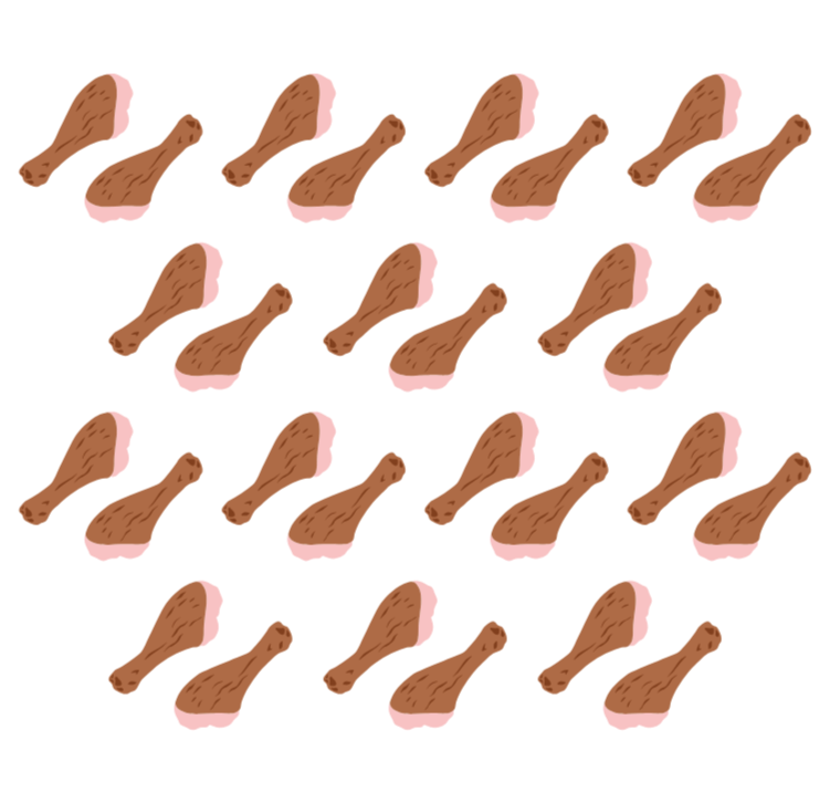
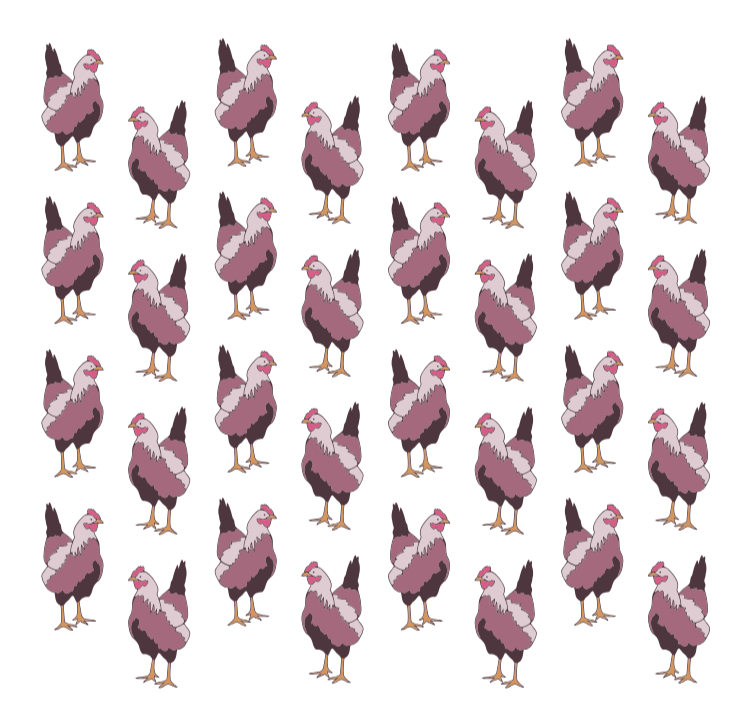
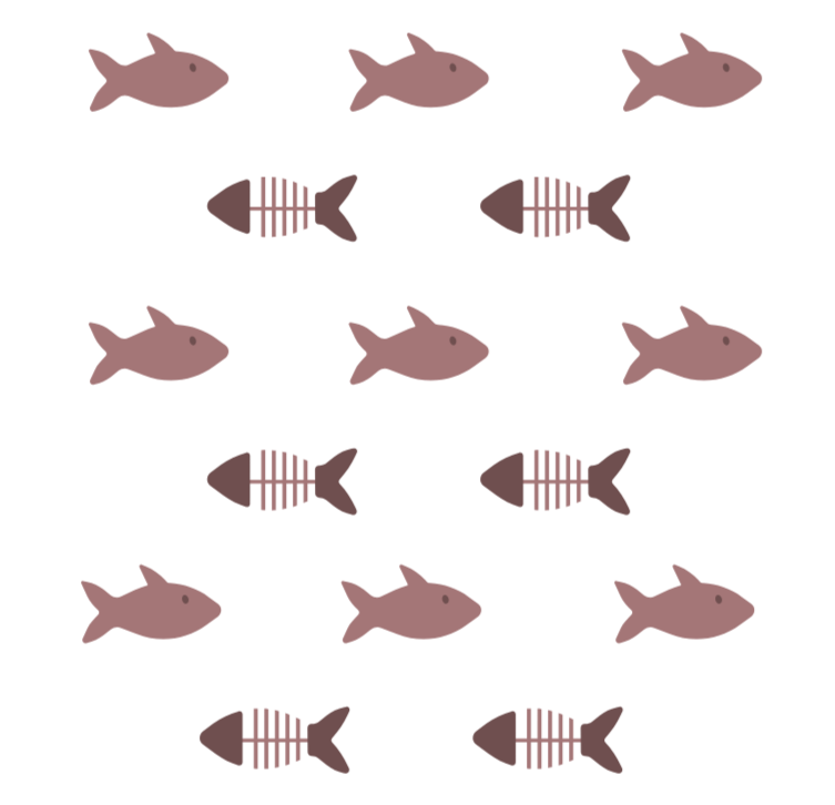
The visual system combines cat themed icons with simple, modern graphics. Repeat patterns featuring paw prints and other cat food related motifs add personality and create consistency across the brand.Custom iconography was developed for each flavor, using simple food illustrations to make the packaging easy to recognize and navigate. Together, these elements create a cohesive visual language that feels fun and refined.
The Process
The project began with exploring the cat food market, looking at existing brands, packaging trends, and the ways such companies communicate quality, nutrition, and personality. From this research, creating a visual direction that showed such elements became the priority.The overall brand identity was developed with inspiration from real life cats. From there, a tortoiseshell breed mascot was created to showcase the playful nature of cats without feeling overly childish.The identity was then translated into various packaging concepts that could work across different flavors and products while remaining recognizable as a unified brand. The exploration of color, composition, and illustration make each package feel both expressive and easy to understand.
© Aleesha Lindstrom 2020-2026 | All Rights Reserved
Project Overview: Sunshine Select
Objective
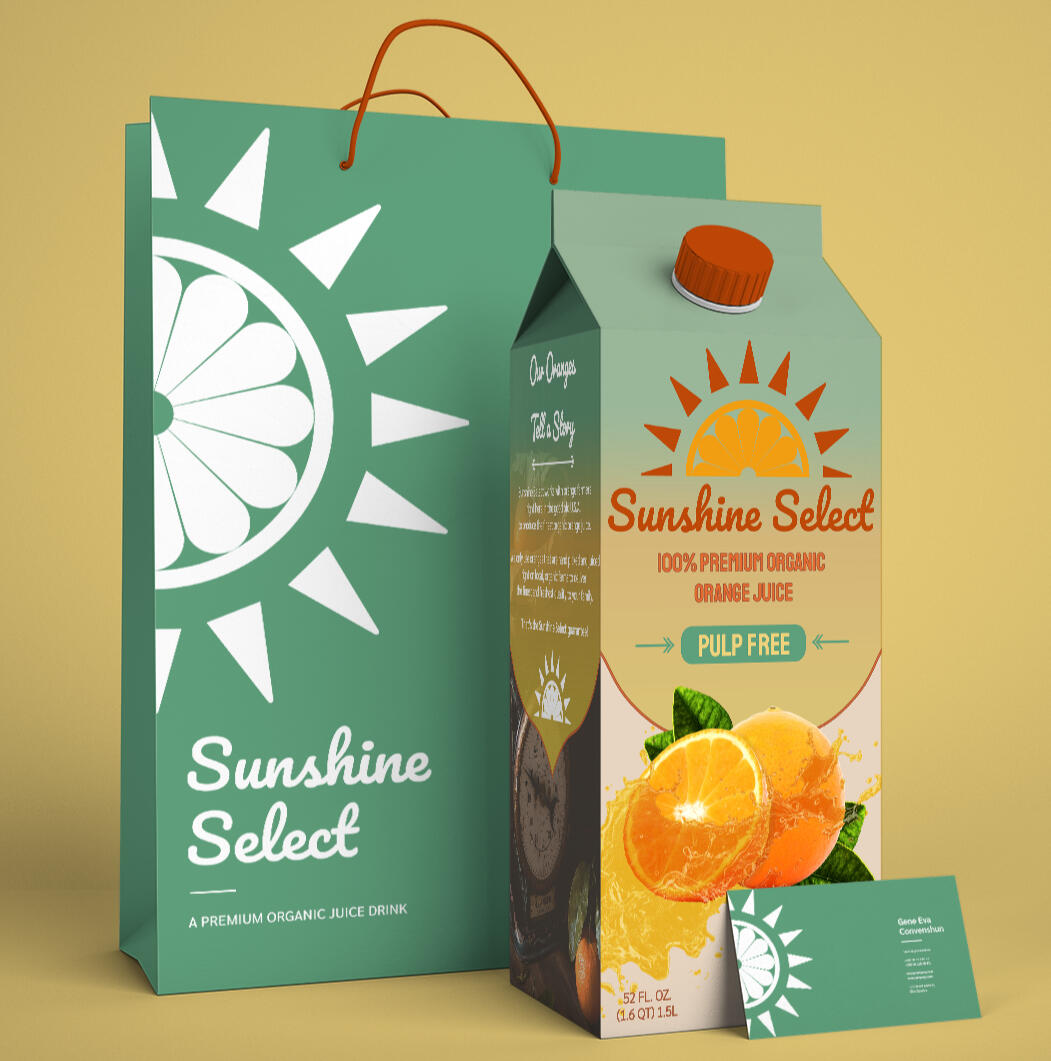
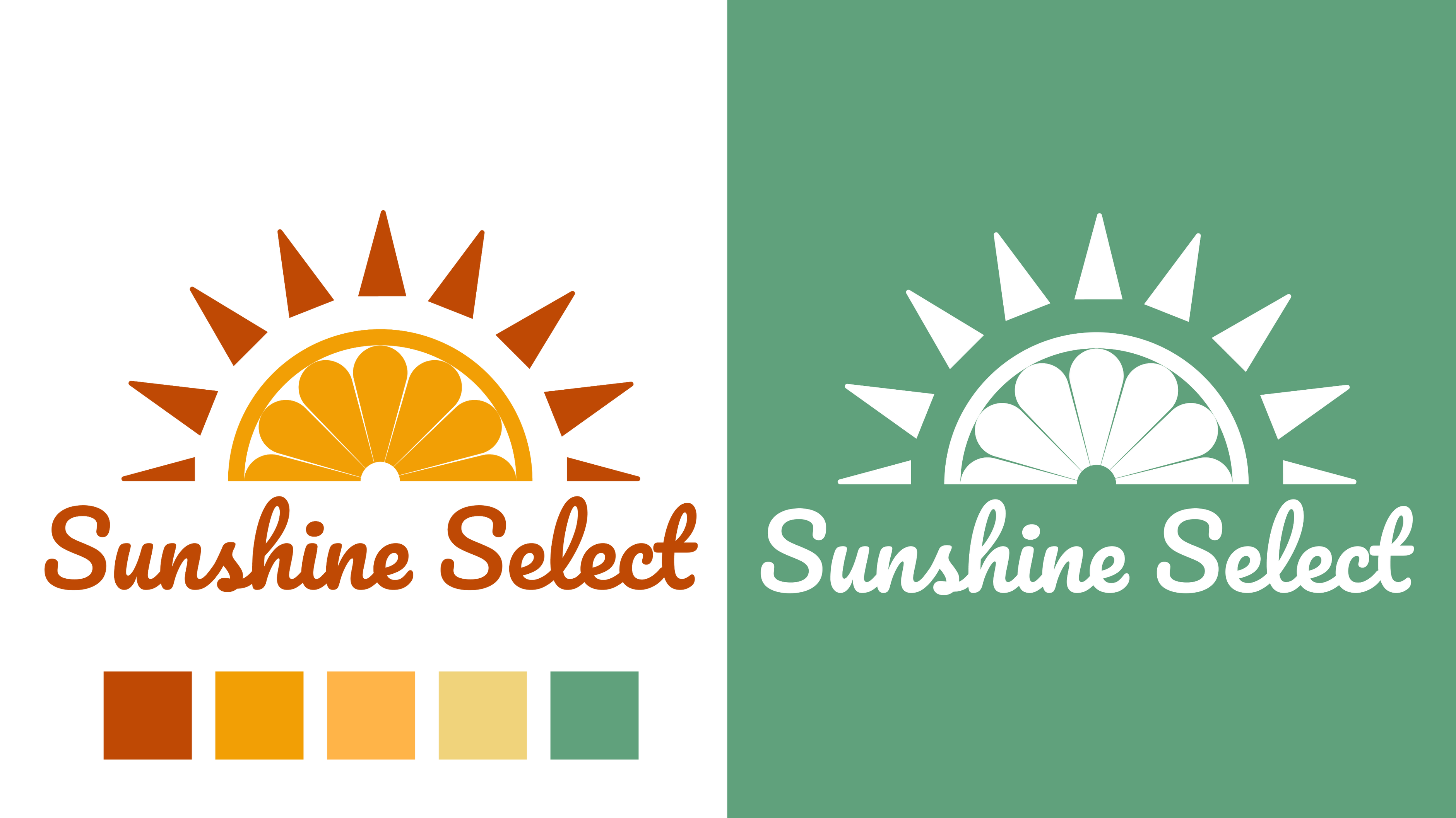
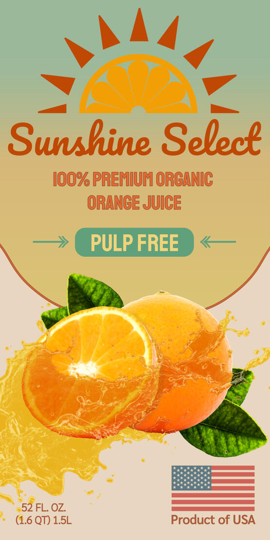
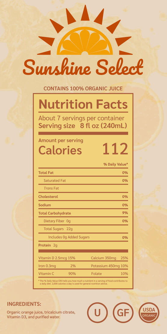
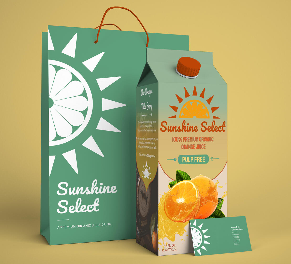
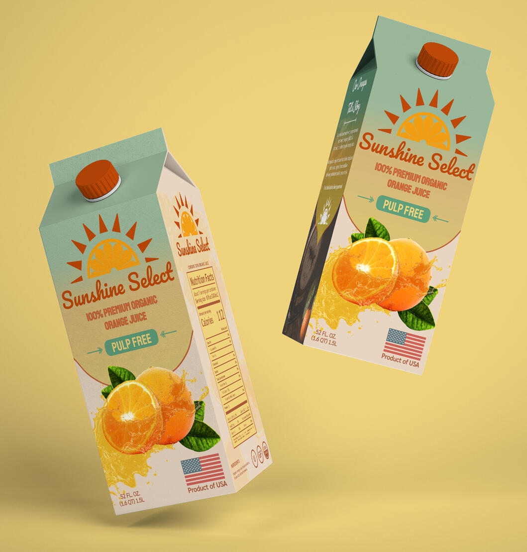
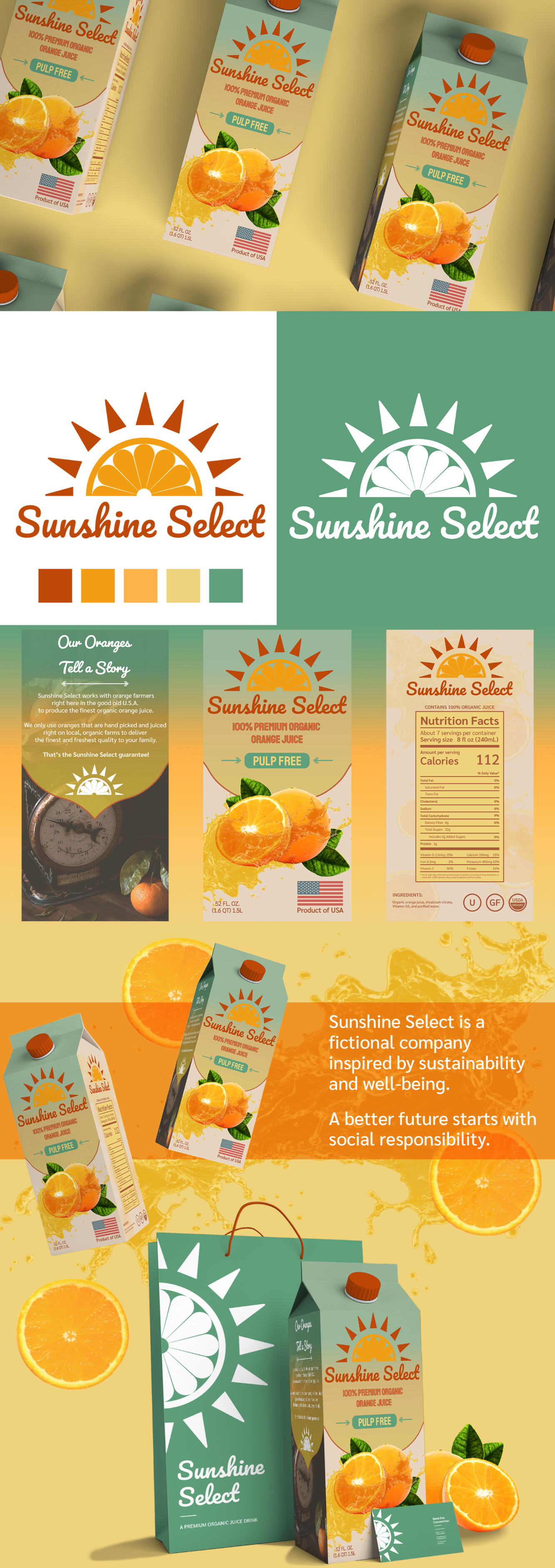
Create a vibrant brand identity and packaging layout for Sunshine Select, a modern and natural orange juice brand. The brand communicates freshness, energy, and a clean visual presentation.
Visual Elements
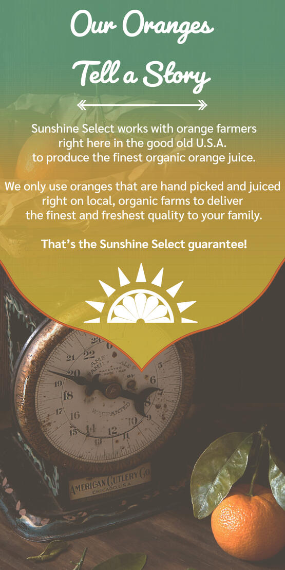
The visual system uses fruit inspired colors and realistic graphic elements to capture the freshness and natural feeling of the product. A subtle gradient creates a recognizable identity, while the bright color palette helps to tell the brand story.Together, these elements create a brand that feels modern while staying connected to the organic qualities of orange juice.
The Process
The project began with researching the orange juice market and exploring how existing brands communicate freshness, quality, and natural ingredients.Through different color palettes, typography, and structure, the visual language became centered around bright colors and rustic graphics, creating a natural feel.The branding was then translated into various packaging concepts that stands out on the shelf while remaining fresh, approachable, and easy to recognize.
© Aleesha Lindstrom 2020-2026 | All Rights Reserved
Project Overview: Sweet Dream Streams
Objective
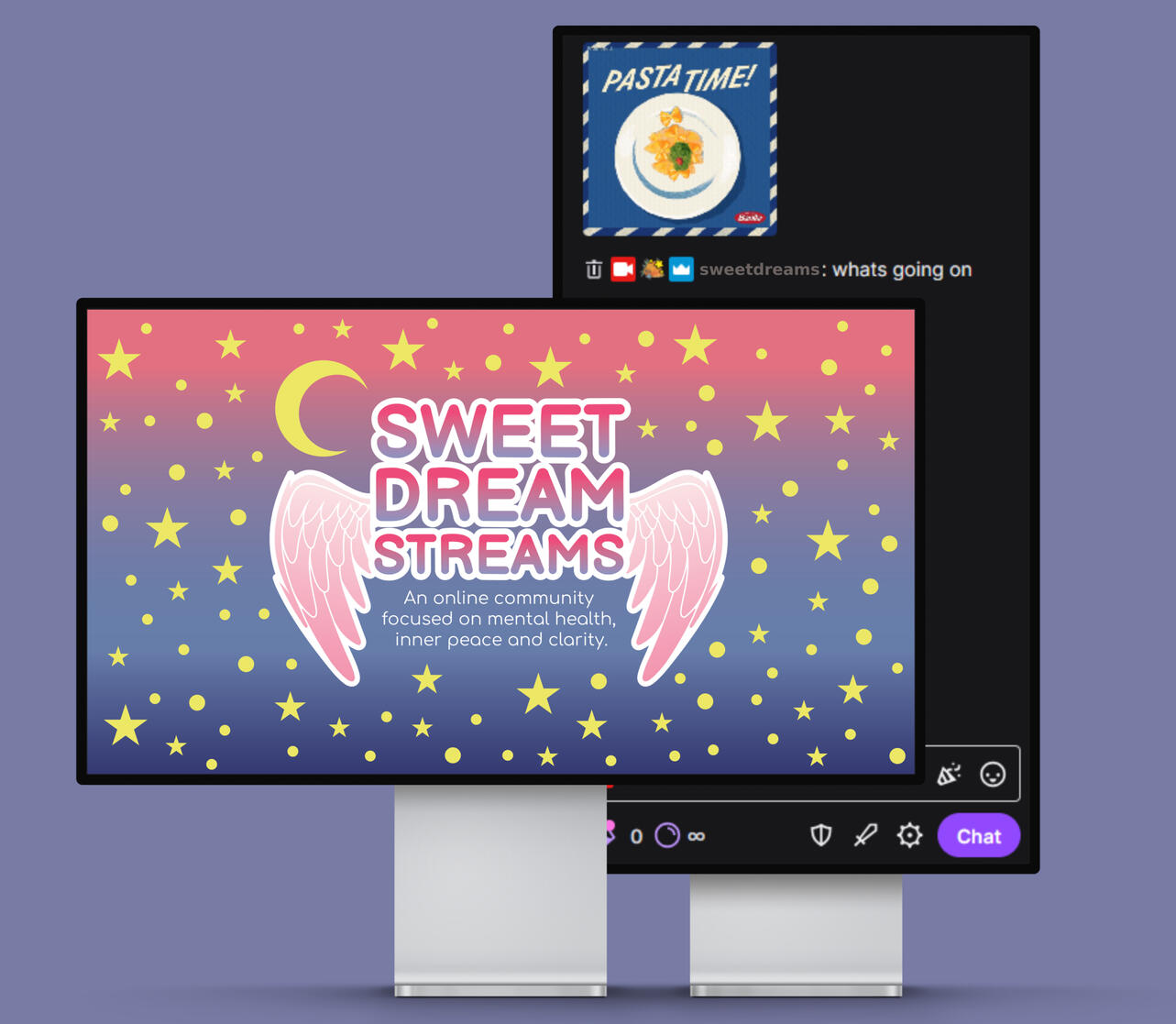
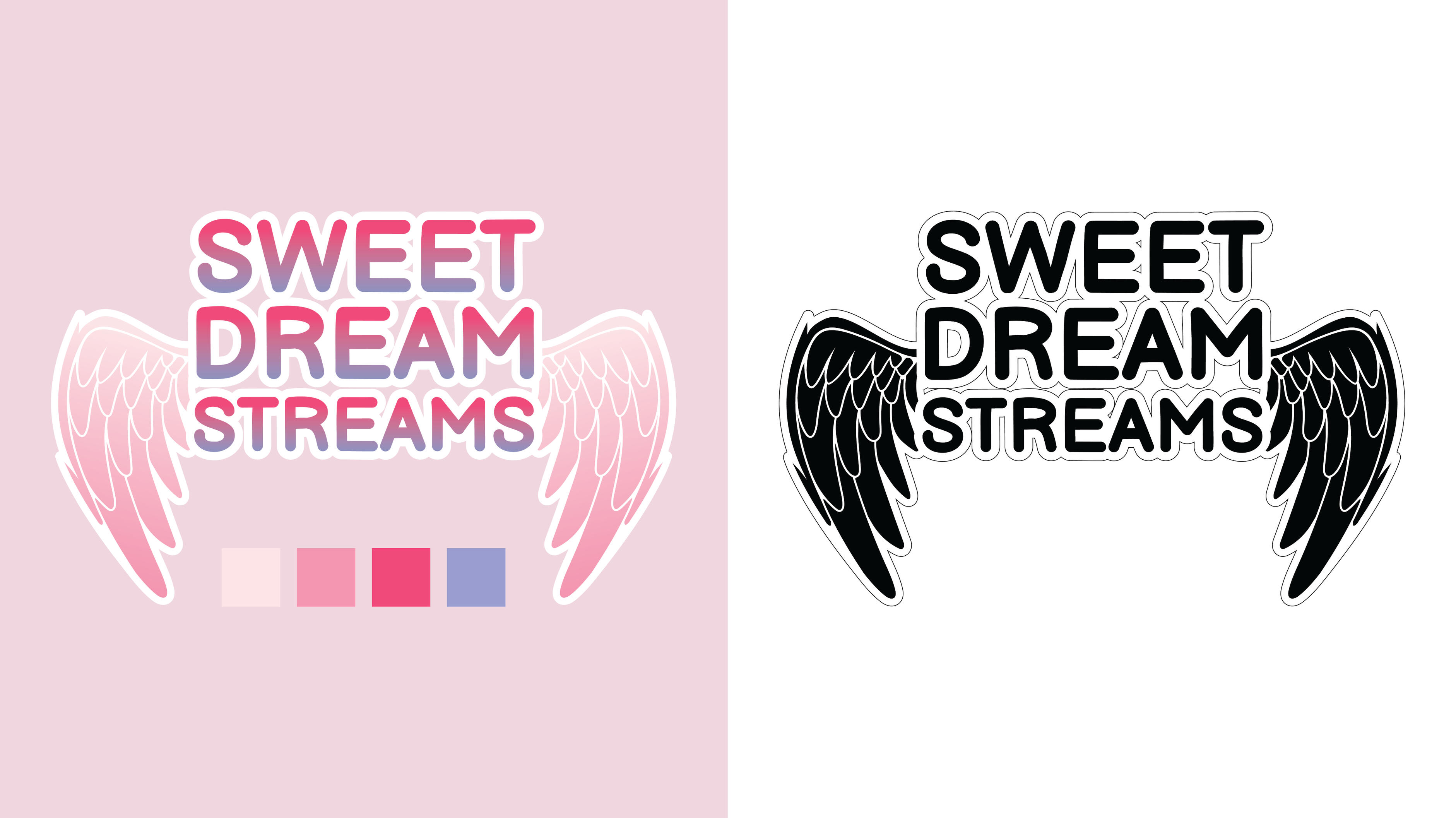
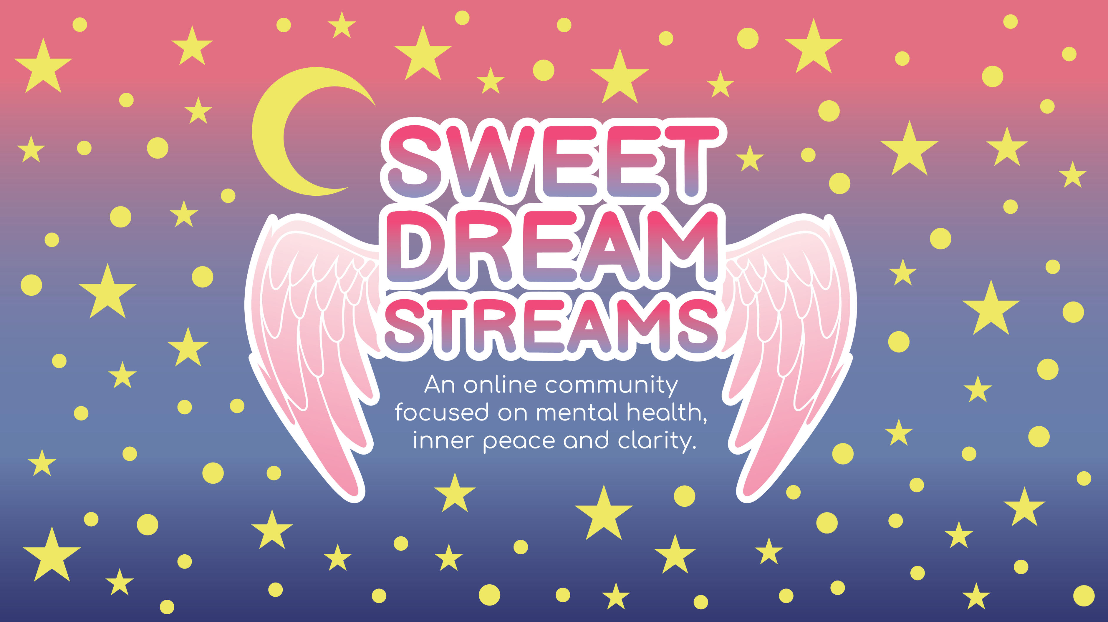
Create a brand identity for Sweet Dream Streams, an online community centered around streaming and mental health. The identity communicates a sense of comfort, positivity, and belonging while remaining connected to online streaming culture.
Visual Elements
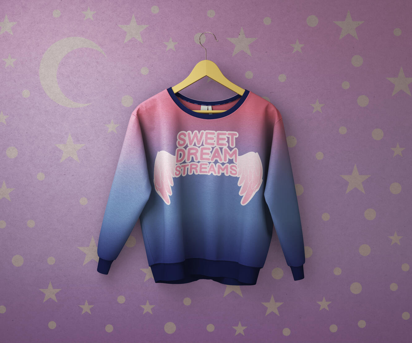
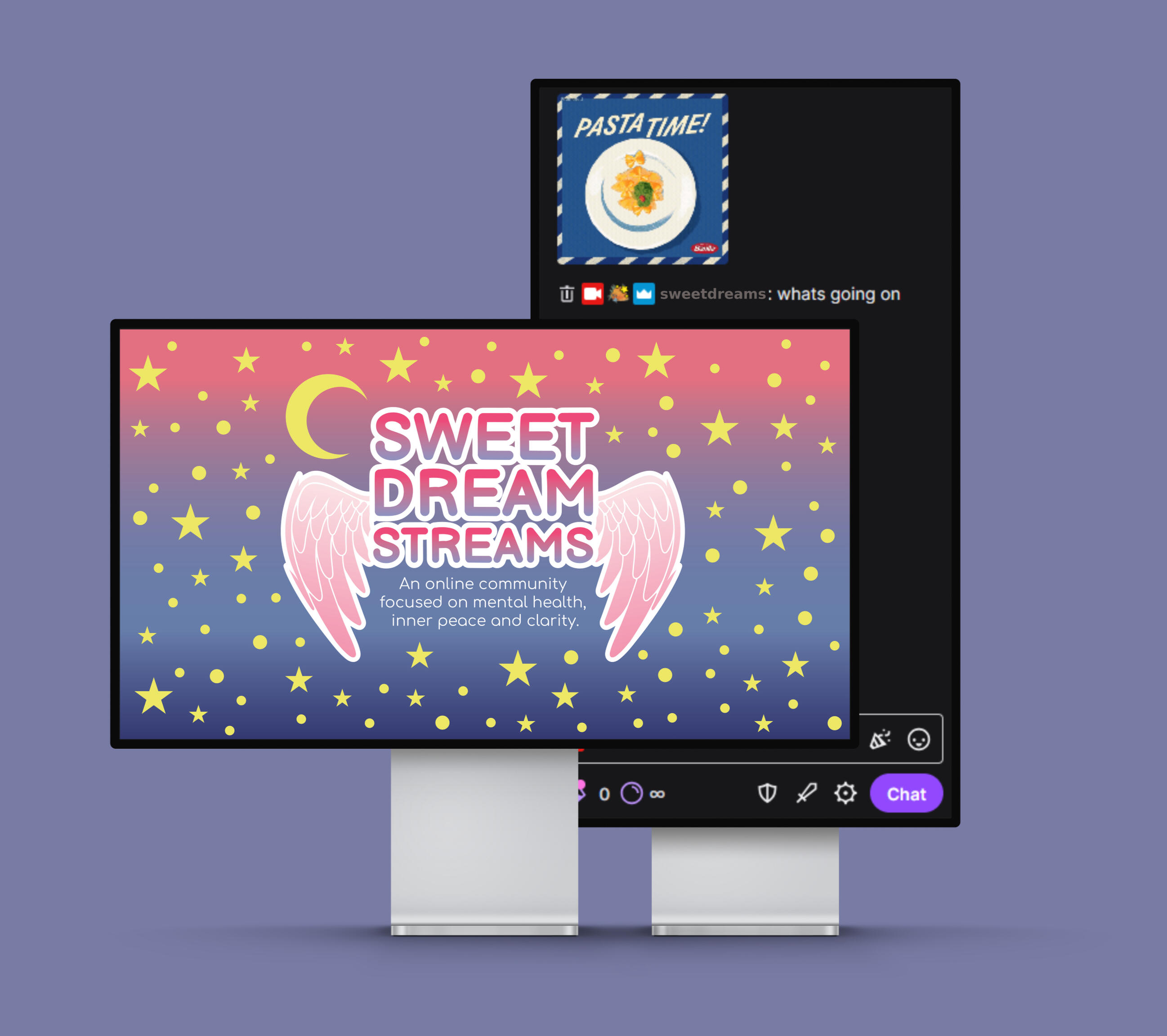
The visual elements combine ideas related to dreams, relaxation, and community. Imagery such as a crescent moon, stars, and angel wings represents the different aspects of the brand.Soft colors such as lavender, blue, pink, and navy create a calming nighttime aesthetic, while rounded typography gives the brand a friendly feel.
The Process
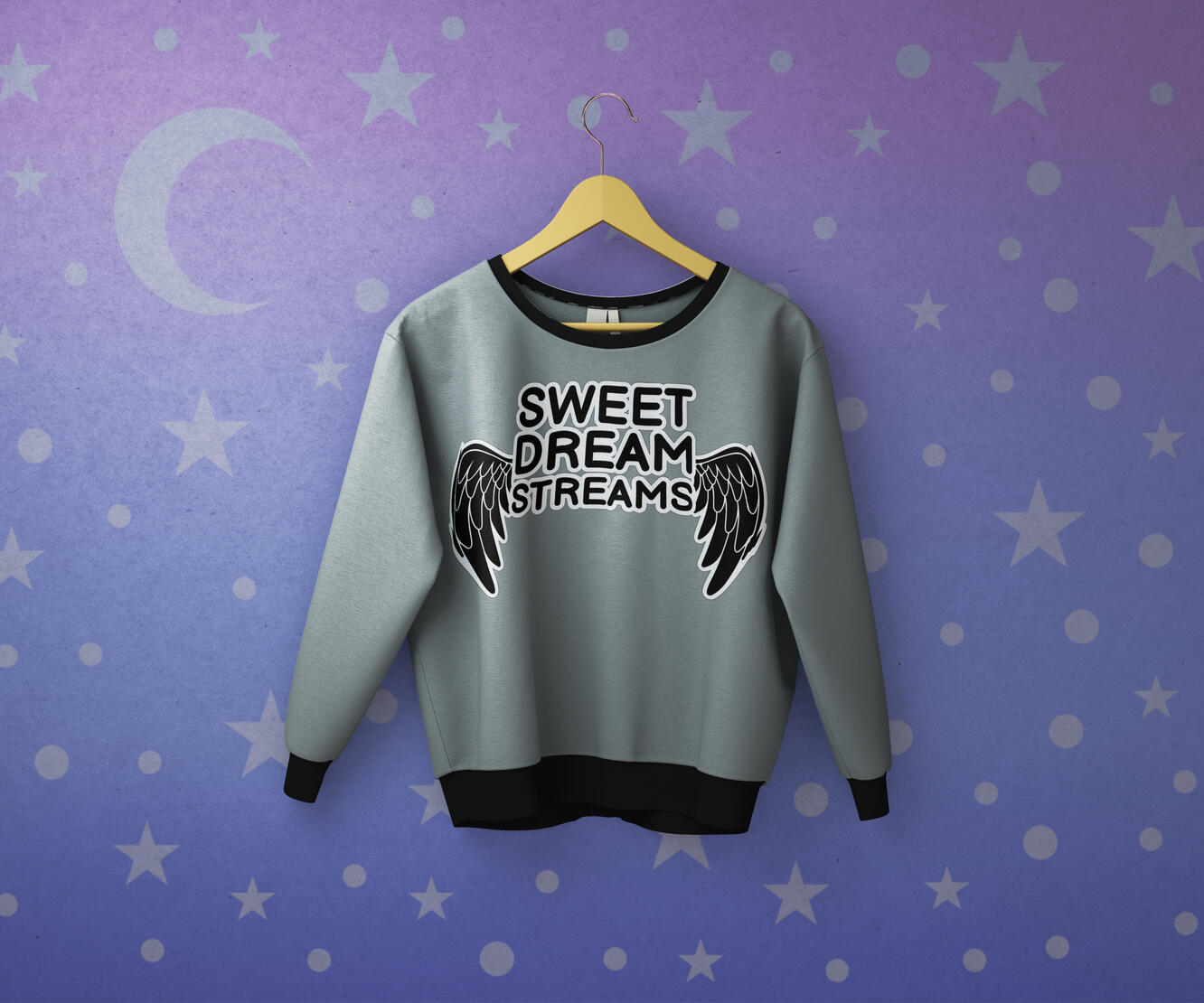
The project began by researching inclusive communities and streaming aesthetics to understand the target audience and establish a visual direction. Different concepts combined imagery related to dreams, streaming, and emotional support.The final branding was developed for and tested across different platforms and merchandise.
© Aleesha Lindstrom 2020-2026 | All Rights Reserved
Project Overview: Rudtym Industries
Objective
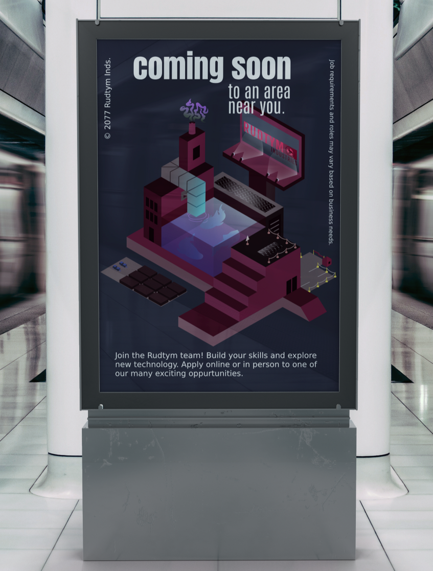
Create a brand identity for Rudtym Industries, a fictional corporation operating at the center of a data-driven efficiency. The identity communicates an advanced, institutional, and slightly unsettling future.
Visual Elements
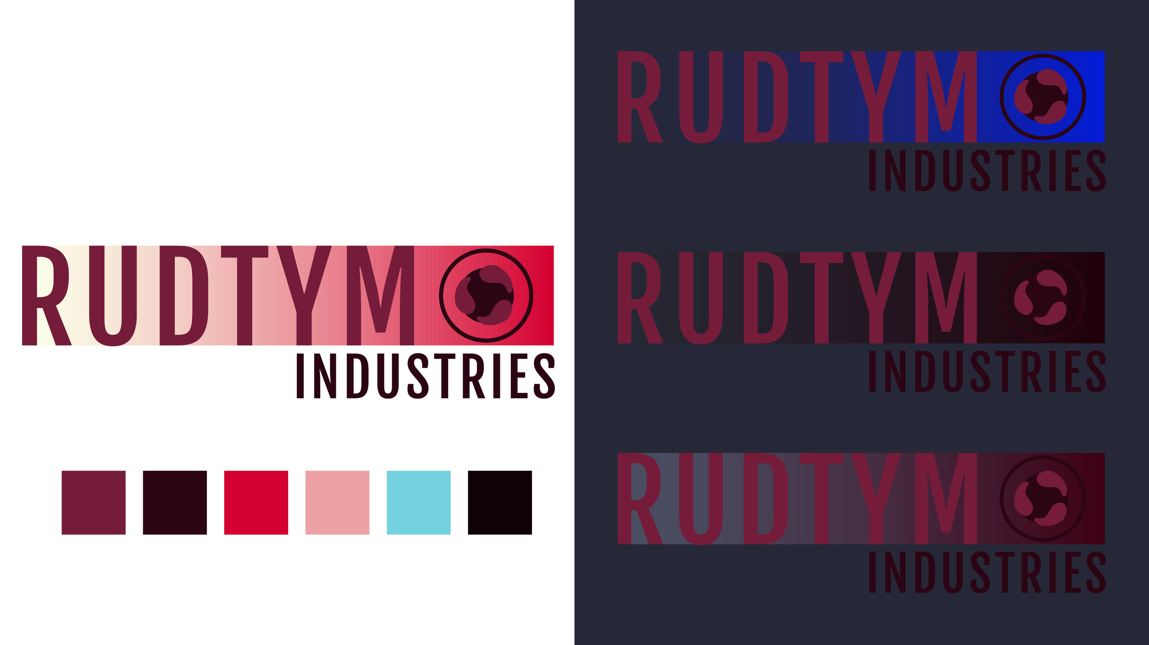
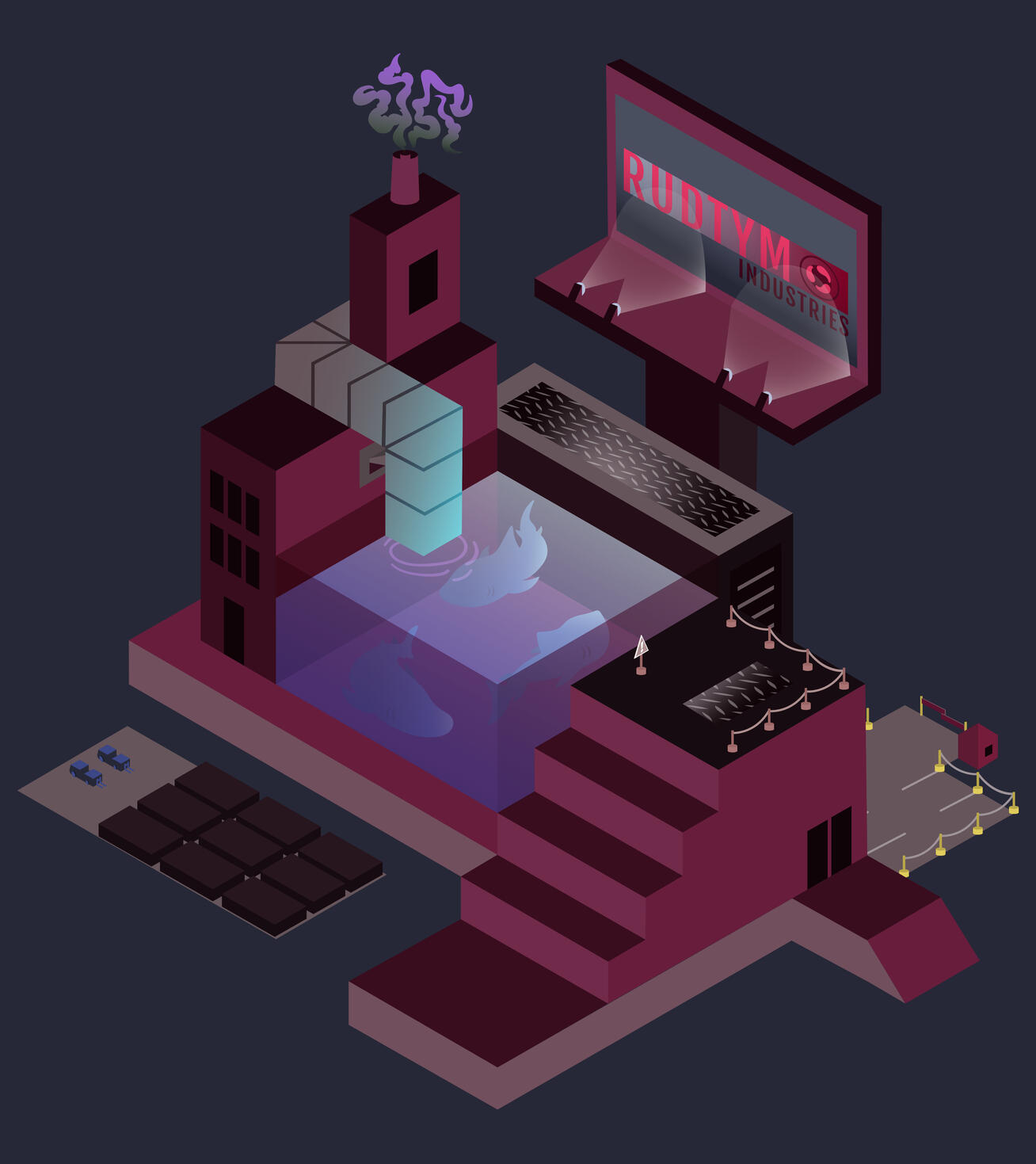
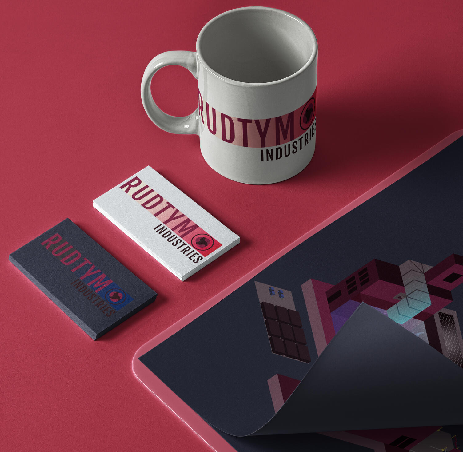
The visual elements use a dark, industrial, futuristic aesthetic to create a dystopian environment. Maroon and metallic tones, sharp geometric typography, and low light help to enforce that feeling.The round icon in the logo represents the three sharks in the pool that are seen in the isometric illustration, while also pulling inspiration from molecular structures.

The Process
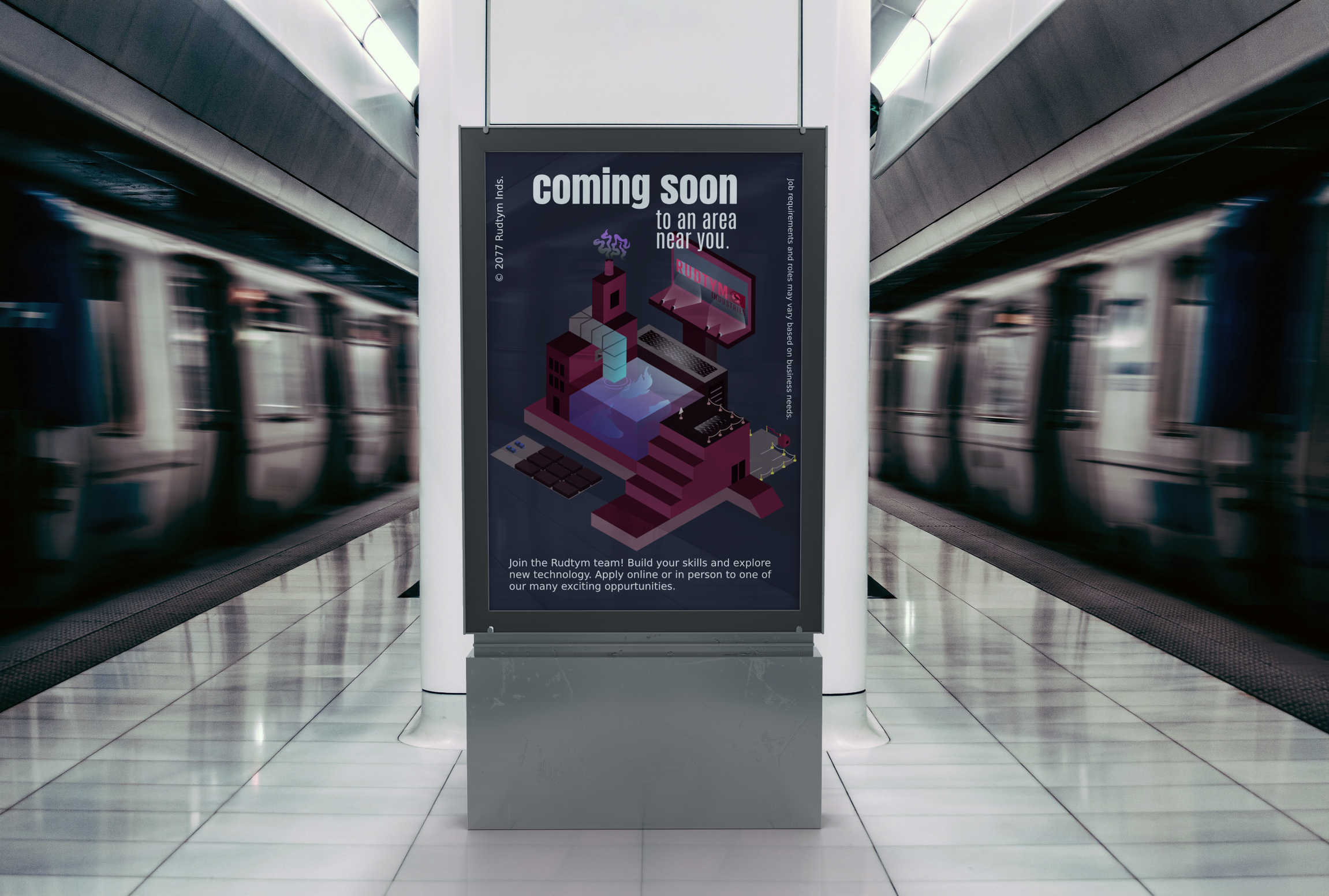
The project began with researching technology and corporate tone. These elements are then combined into consistent layouts for advertisements, signage, and other brand applications.The final result is an identity that feels institutional and slightly eerie.
© Aleesha Lindstrom 2020-2026 | All Rights Reserved
Project Overview: Devils and Dice
Objective
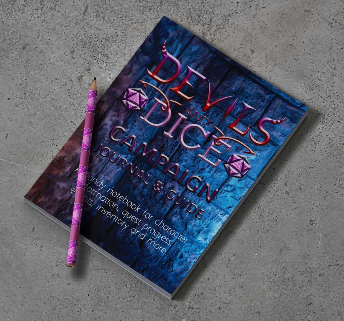
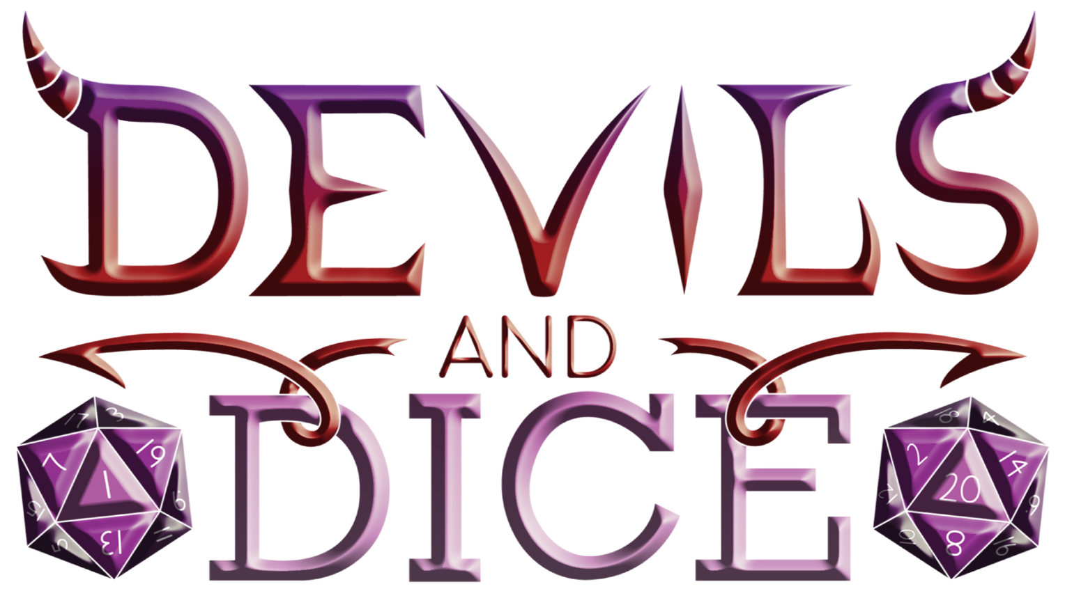
Create a distinctive brand identity for Devils & Dice, a TTRPG business that brings players together through storytelling, imagination, and shared adventure. The brand communicates dark fantasy with fun by creating a world that feels mysterious, adventurous, and inviting to all.
Visual Elements
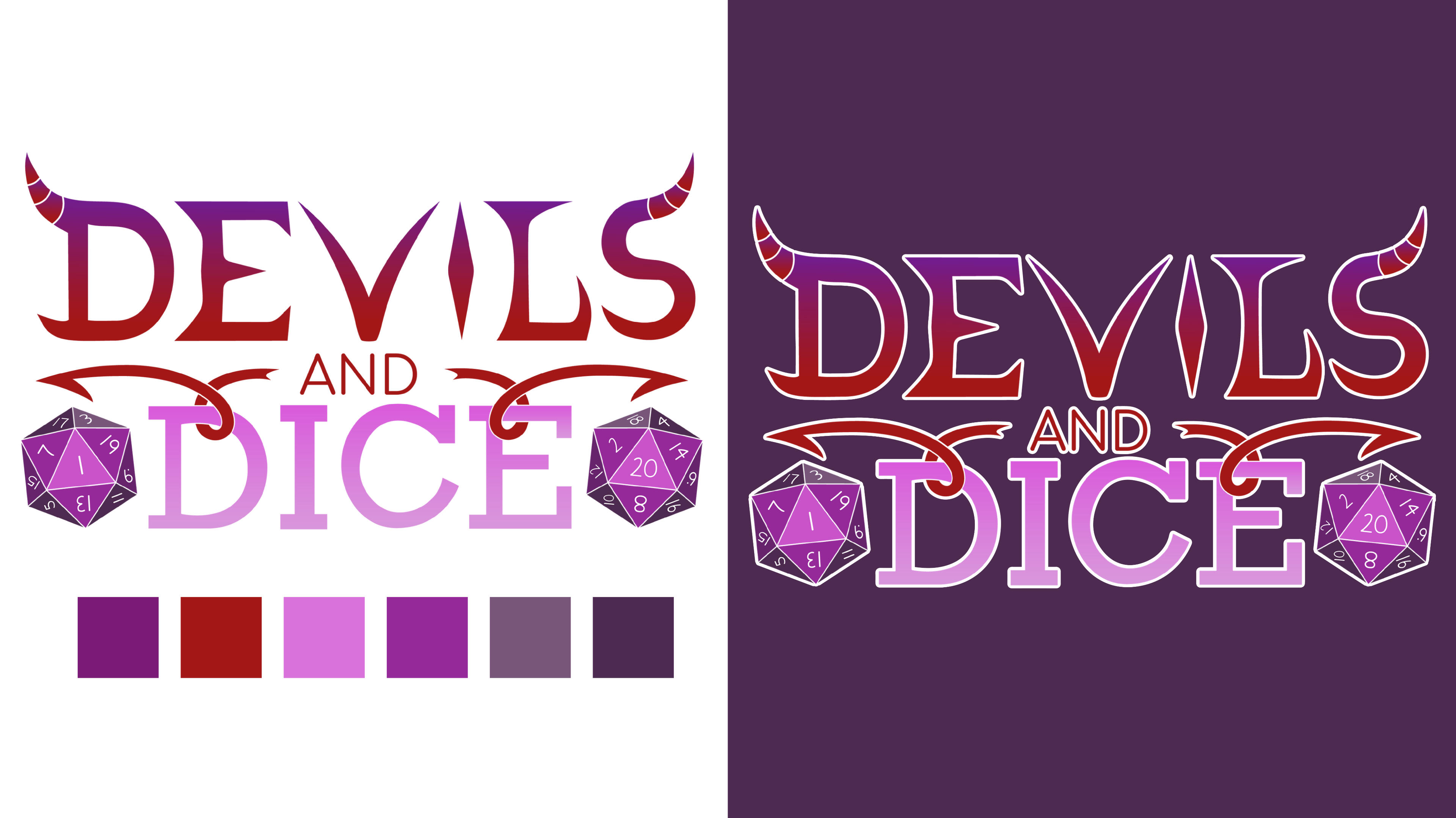
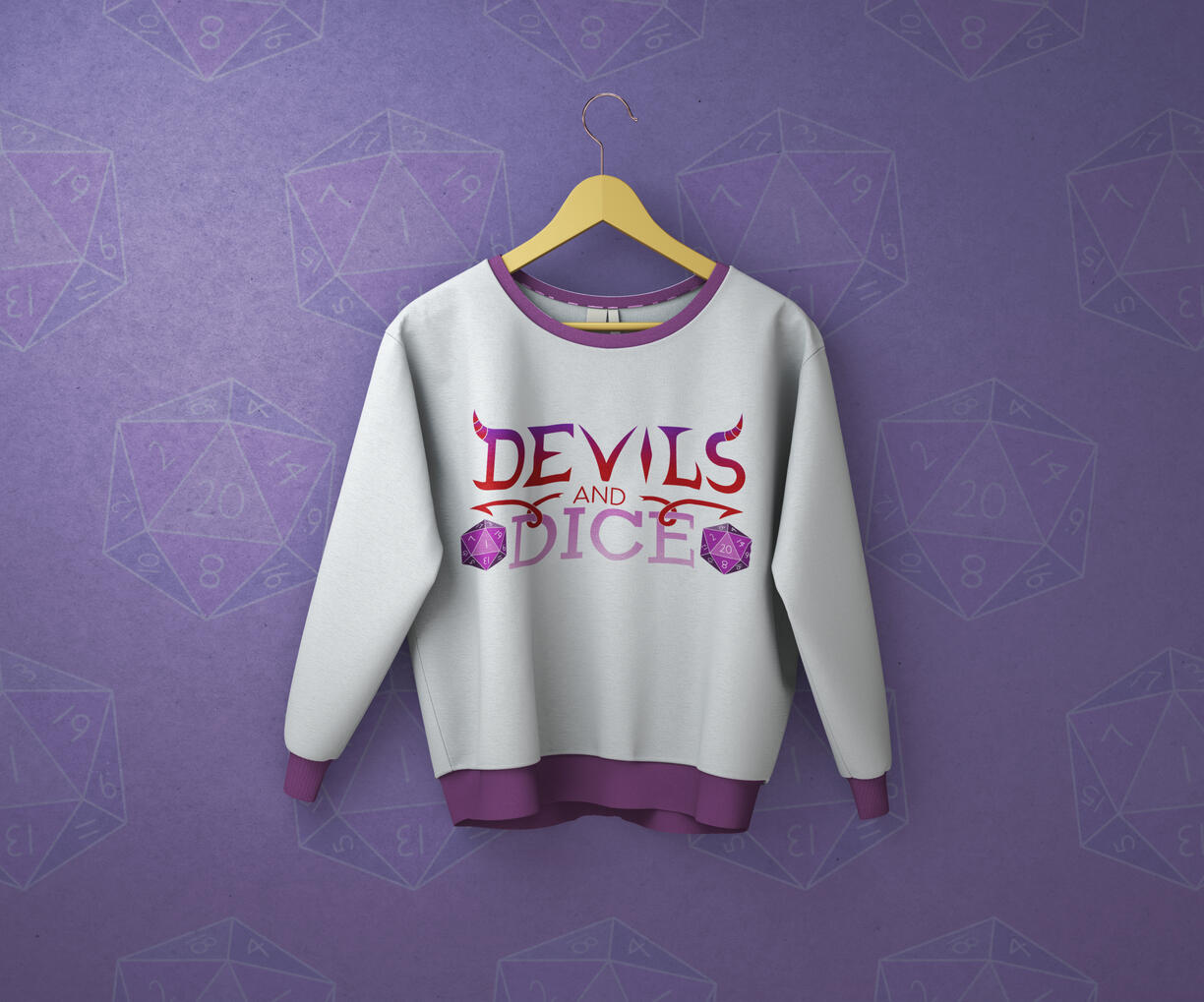
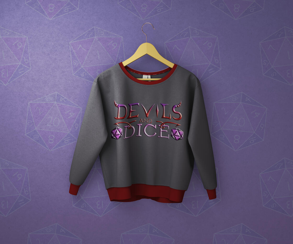
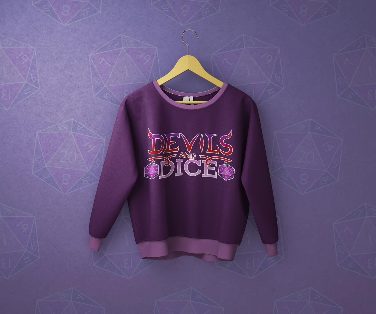
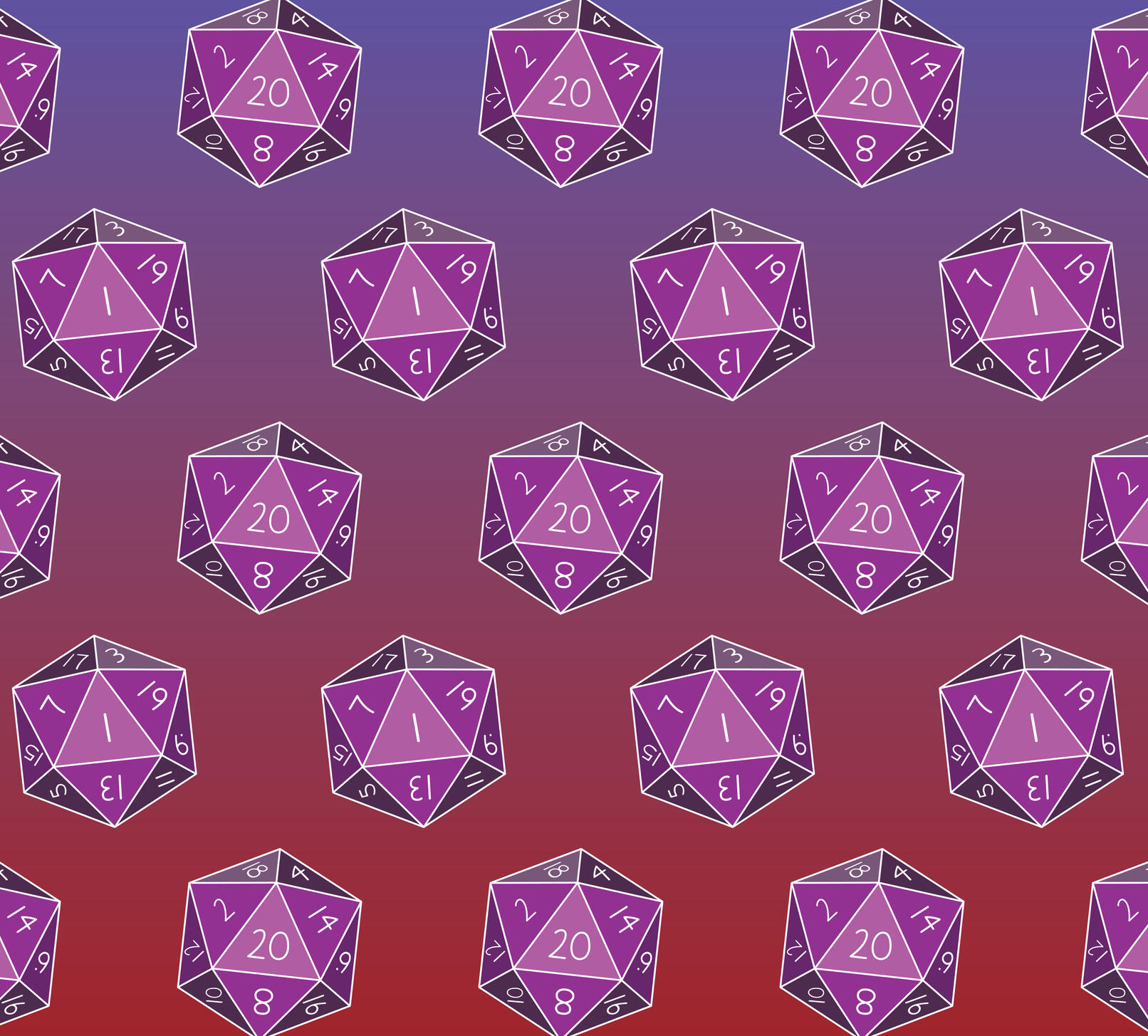
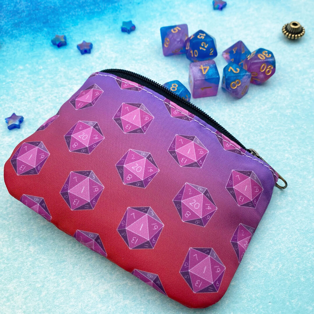
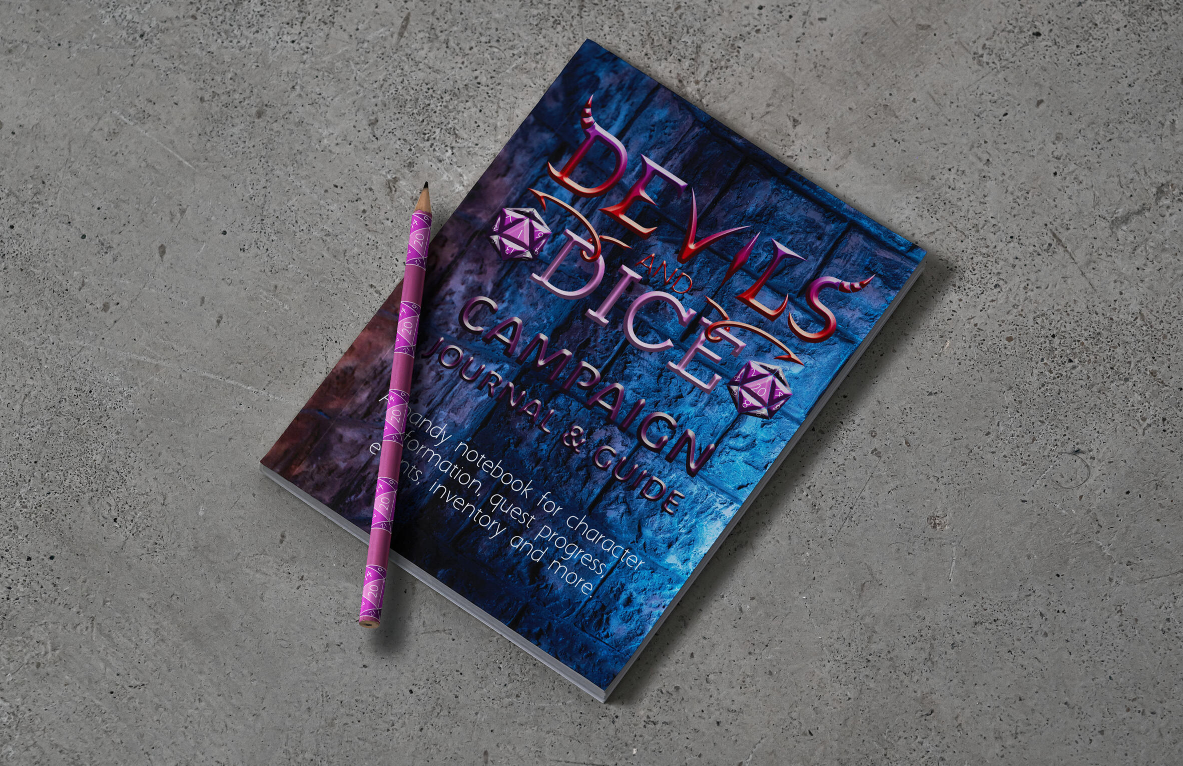
The visual elements draw from the aesthetic of independent game shops and medieval fantasy elements. A palette of reds and purples gives the identity a fantasy feeling, while dimensional and hand drawn letters keep the logo unique to the time period it is inspired by.The arrows near the word "and" are not only meant to symbolize devil tails, but the motion of rolling dice as you play a TTRPG.The brand identity combines old-world symbolism with underground gaming culture, creating a bold and easy to understand aesthetic.
The Process
The project began with research into gaming culture, dark fantasy, folklore, and the visual language of traditional gaming materials. These influences were combined with TTRPG and medieval elements to establish a visual direction that felt both immersive and fun.The identity was then developed across different layouts for game-related products and merchandise.The final result is a brand identity that feels adventurous while capturing the creativity and unpredictability of tabletop roleplaying.
© Aleesha Lindstrom 2020-2026 | All Rights Reserved
Project Overview: Panda PC
Objective
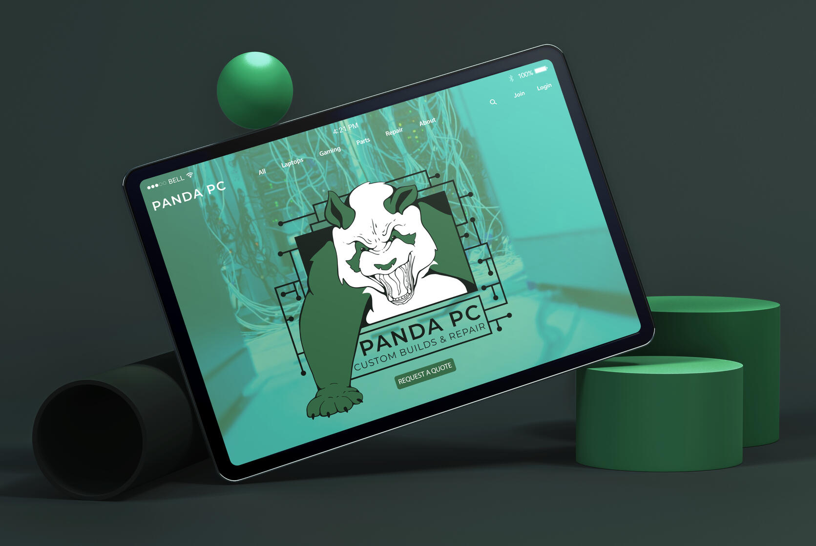
Create a visual identity for Panda PC, a computer business specializing in custom PC builds, repairs, and upgrades. The brand communicates technical expertise with an aggressive personality to stand out from traditional computer businesses.
Visual Elements
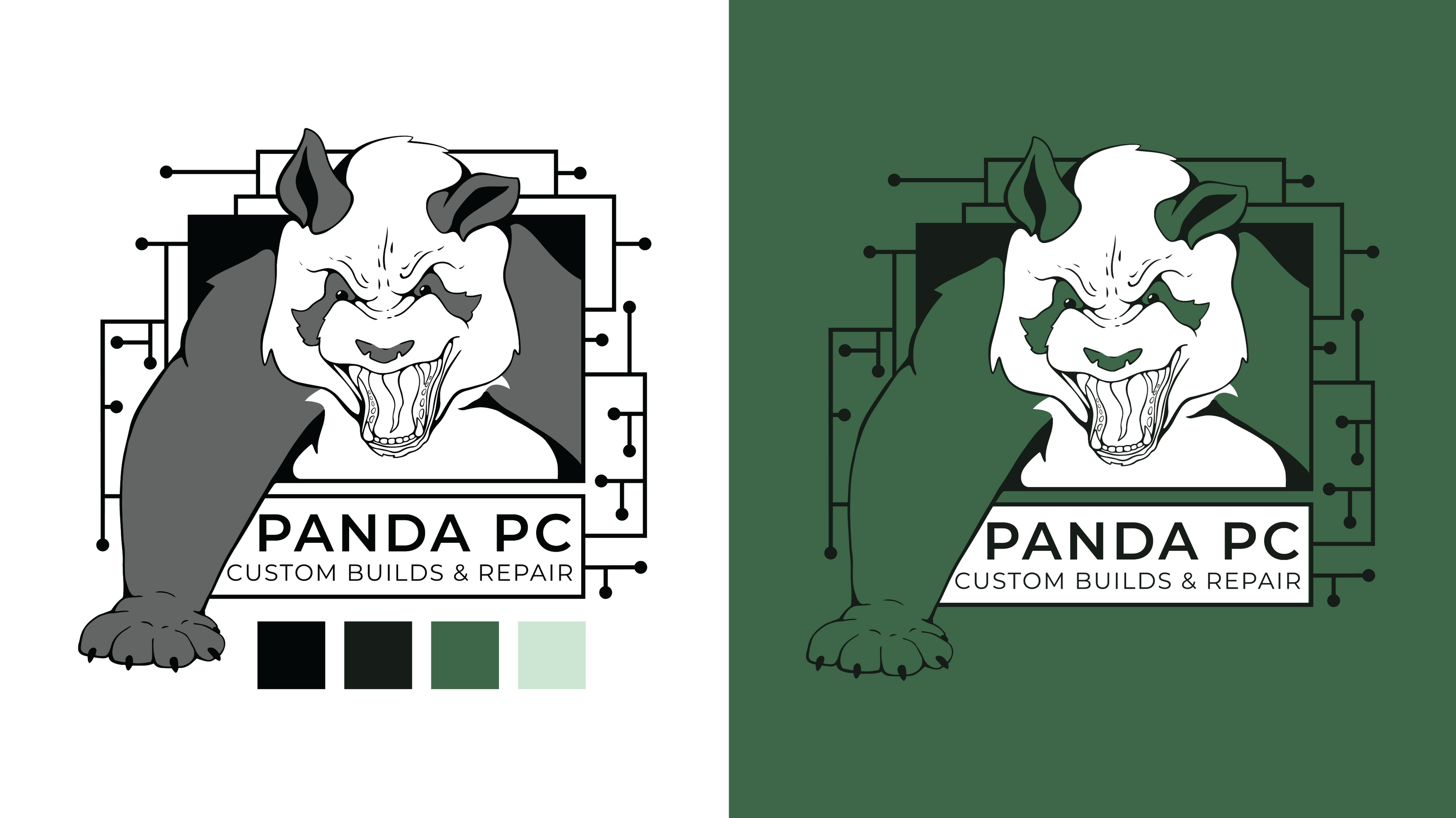
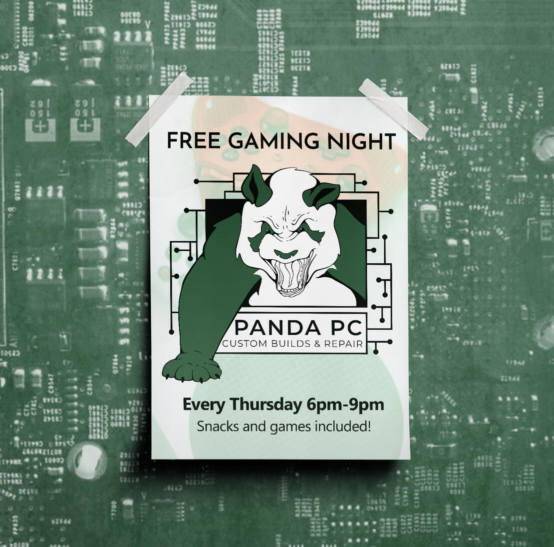
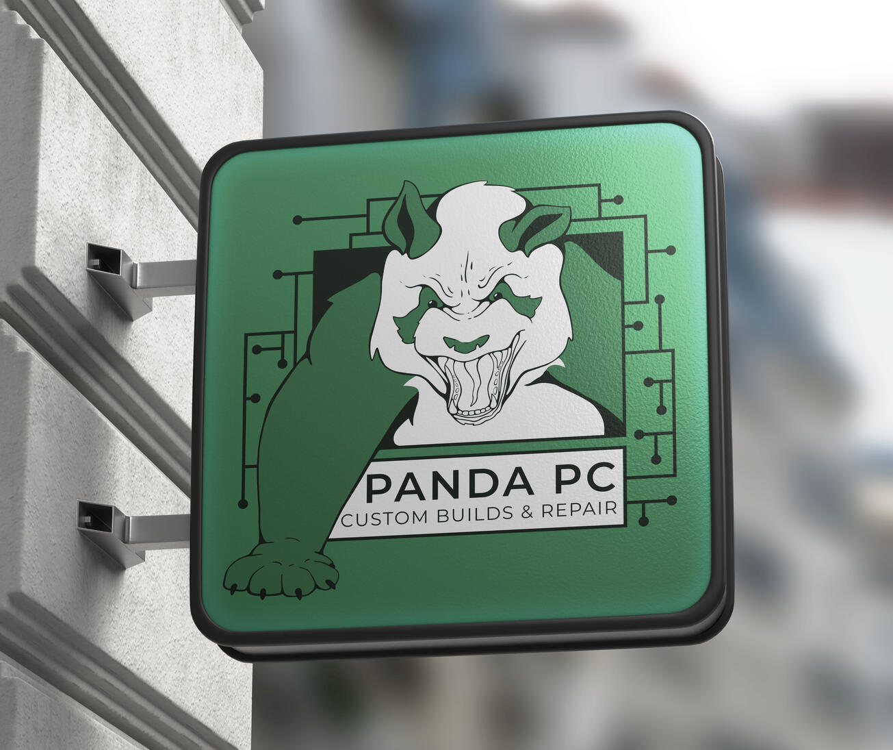
The visual elements draw from computer hardware, particularly the green tones and intricate patterns found on motherboards. This helps to create a rugged and technical aesthetic.The logo features an angry panda breaking through a circuit board, combining the personality of the brand with its focus on computers and technology.
The Process
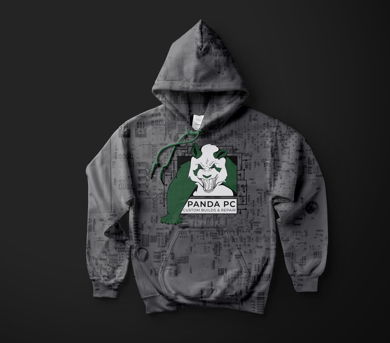
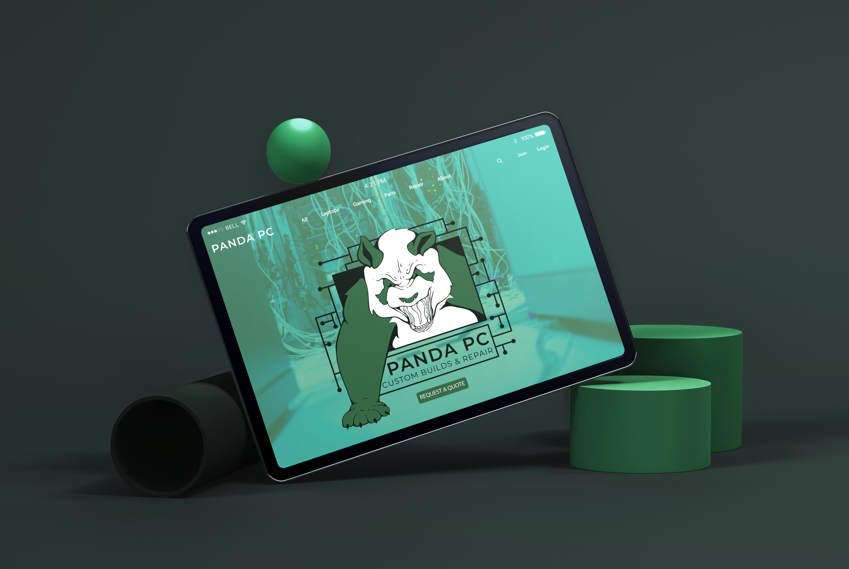
The project began with research into computer hardware, custom PC building, and the the visual language of independent computer shops.Motherboards, circuitry, and computer components became the foundation for the visual direction, while the panda introduced a unique mascot for the brand.The logo was developed around the idea of an angry panda breaking through a circuit board, creating a visual representation of the brand's strength and technical focus. These elements were then carried across promotional materials, merchandise, signage, and digital applications.The final result is a visual identity that has a recognizable presence within the computer industry.
© Aleesha Lindstrom 2020-2026 | All Rights Reserved
Project Overview: Refined Ratrods
Objective
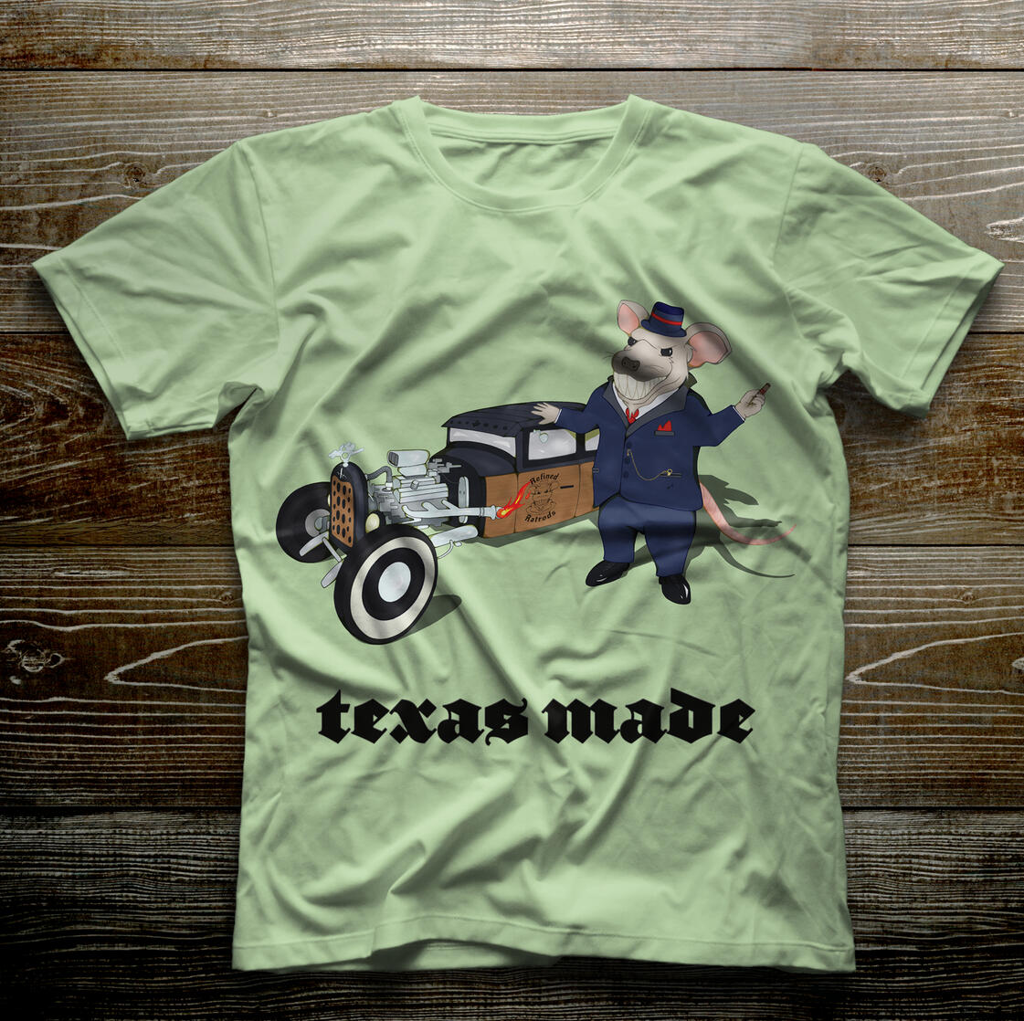
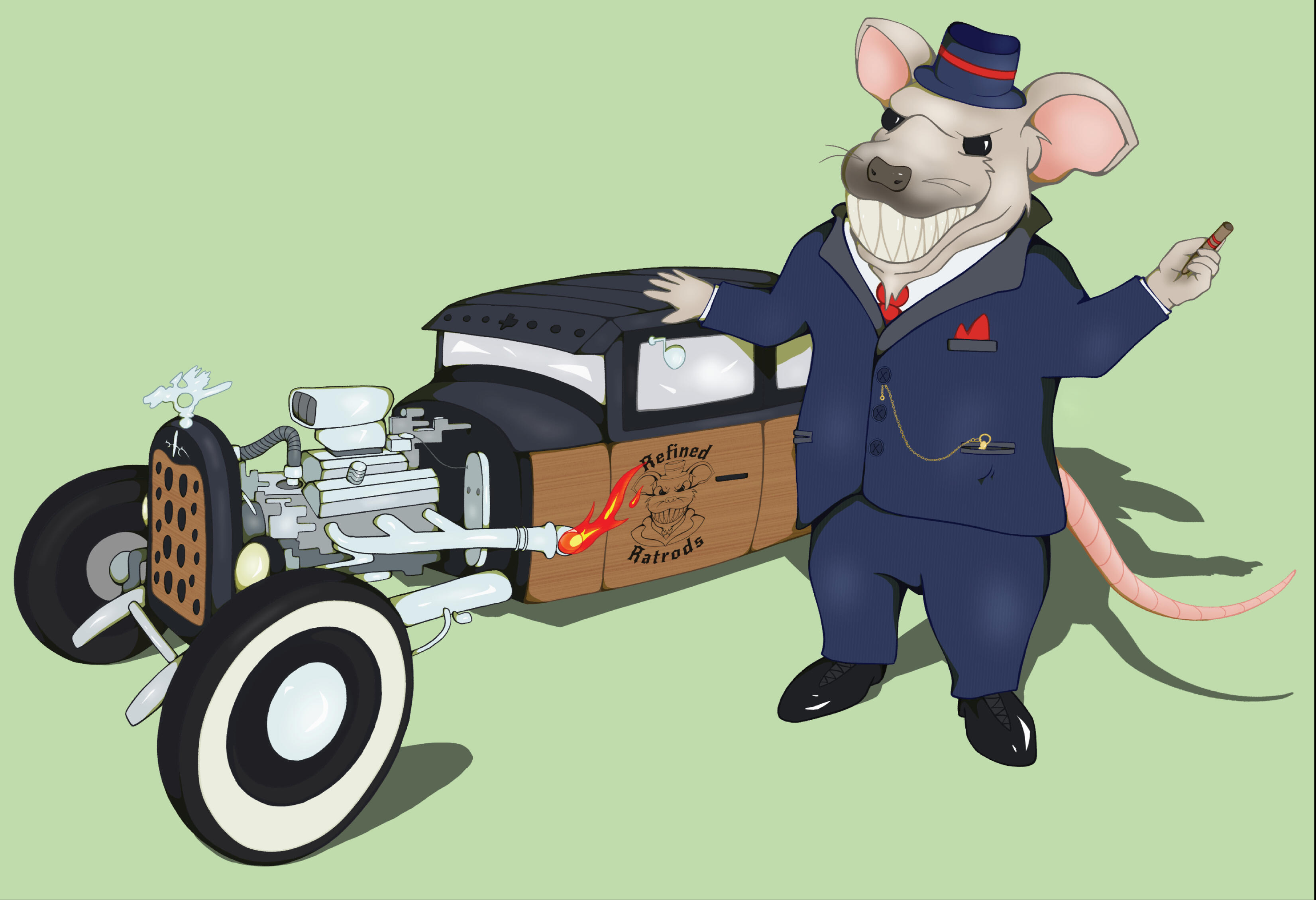
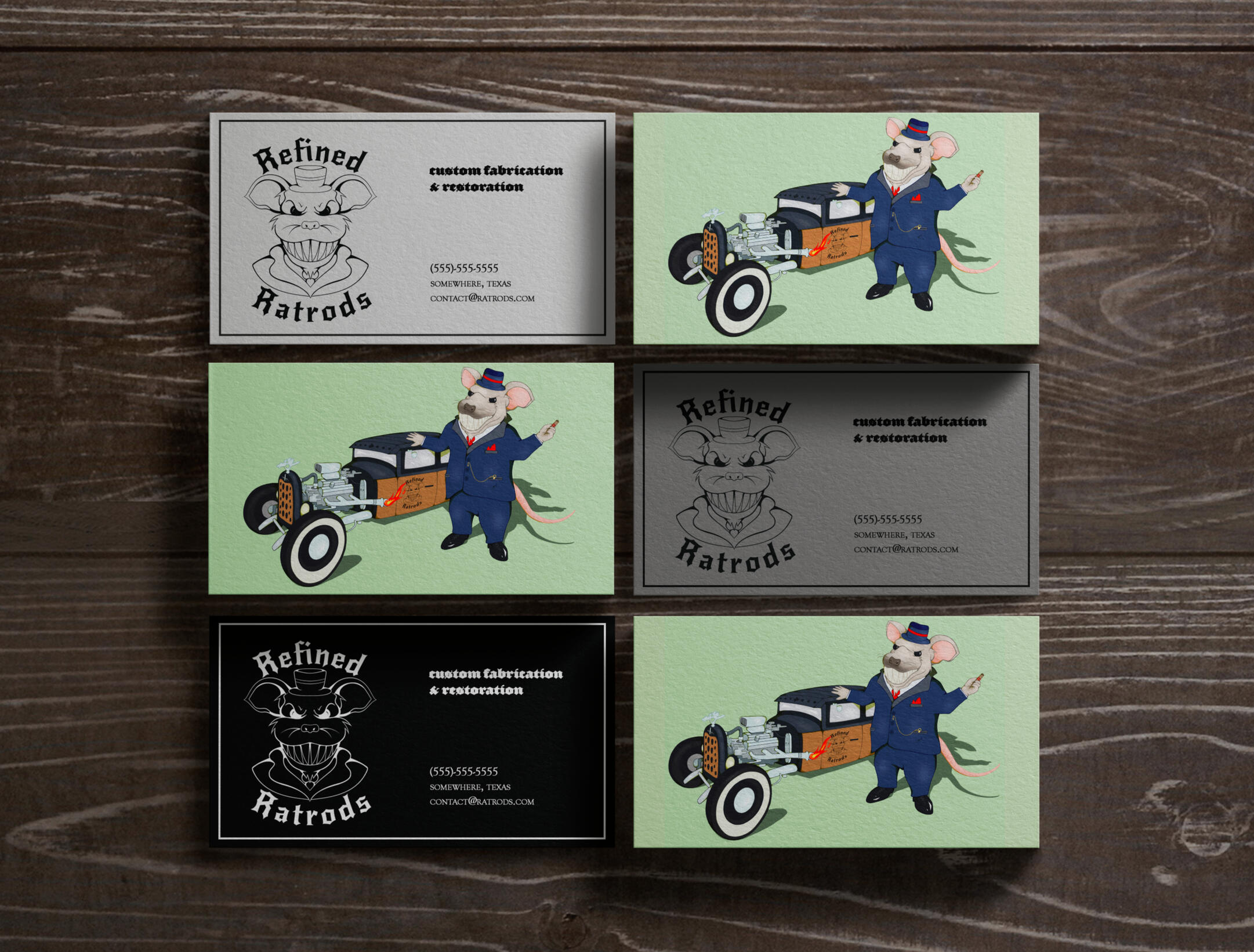
Create a visual identity for Refined Rat Rods, a Texas-based automotive business specializing in custom car modifications and rat rod builds. The brand communicates the toughness of rat rod culture while also being rooted in custom automotive craftsmanship.
Visual Elements
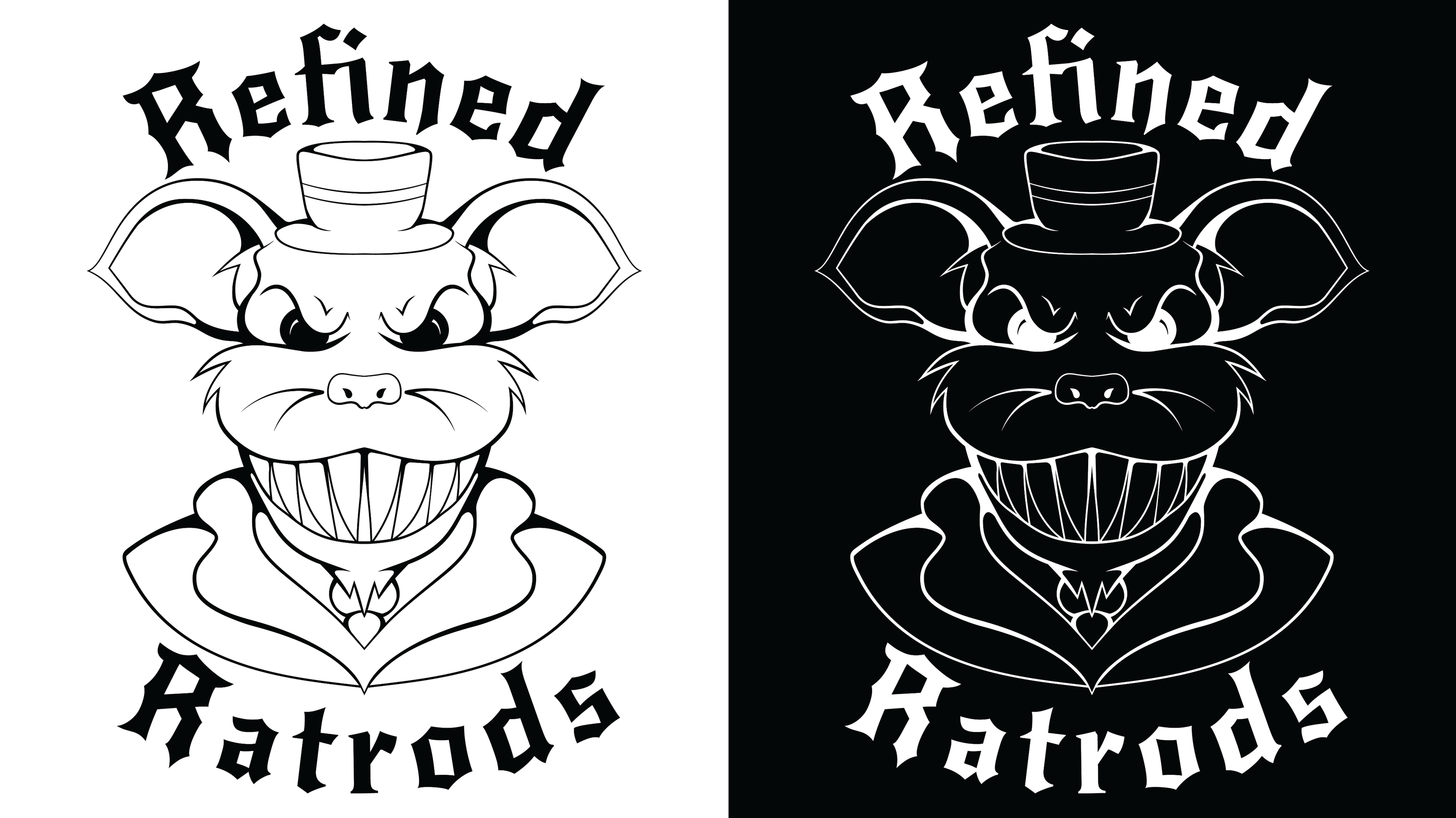
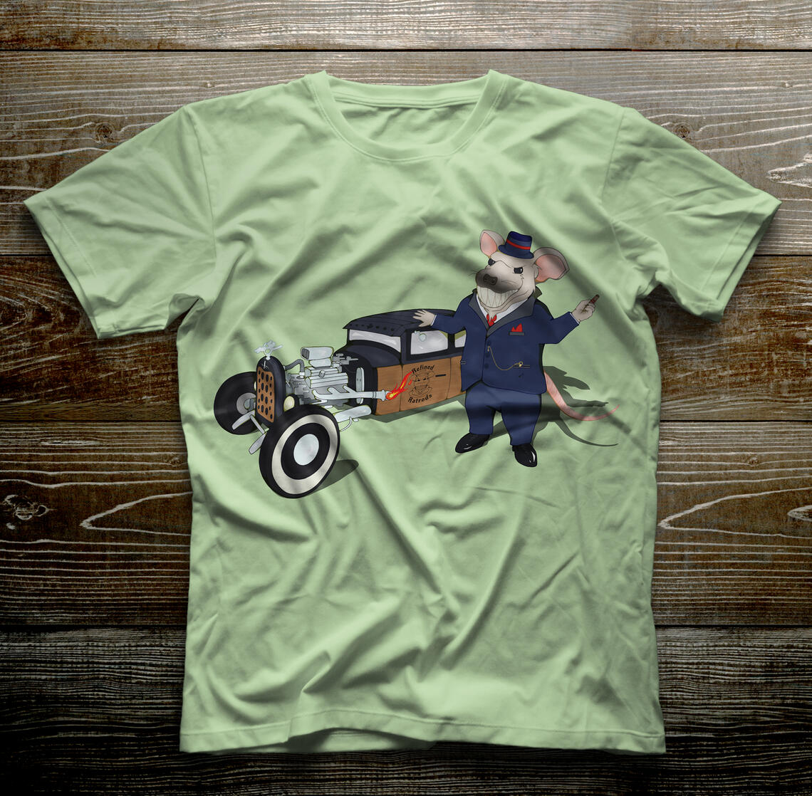
The visual elements draw from classic rat rods and garage aesthetics. Dark tones and vintage typography create a rugged and industrial look.A custom rat mafia character serves as the centerpiece of the identity, giving the brand a recognizable personality and a sense of attitude. The character combines the toughness and sophistication of rat rod culture.
The Process
The project began with research into custom automotive design, vintage hot rods, and mafia culture to develop a brand direction that felt gritty, confident, and distinctive.The mascot was developed as a way to represent the attitude and craftsmanship behind the business. The mascot and supporting graphic elements were then adapted across decals, merchandise and other brand materials.The final result is a bold visual identity that captures the rebellious spirit of rat rod and custom automotive culture.
© Aleesha Lindstrom 2020-2026 | All Rights Reserved
Project Overview: Crooked Arrow Stitch Co.
Objective
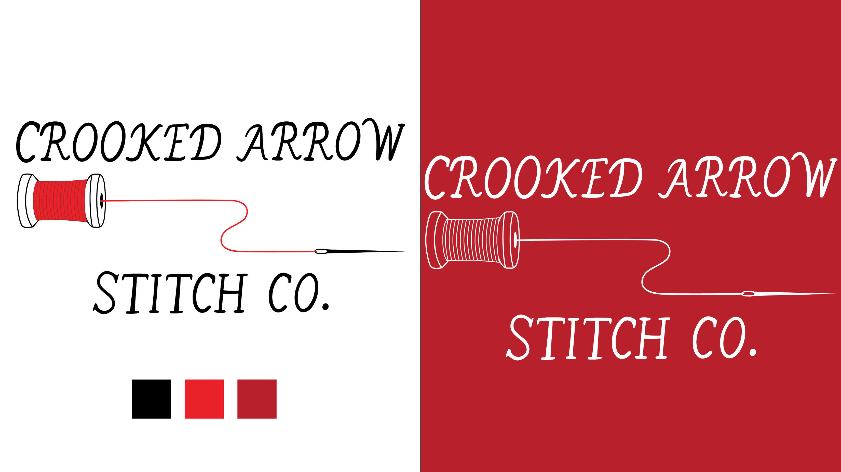
Create a visual identity for Crooked Arrow Stitch Co., a Texas-based embroidery and textile business specializing in custom stitching and sewn goods. The brand communicates traditional craftsmanship and the individuality of custom textile work.
Visual Elements
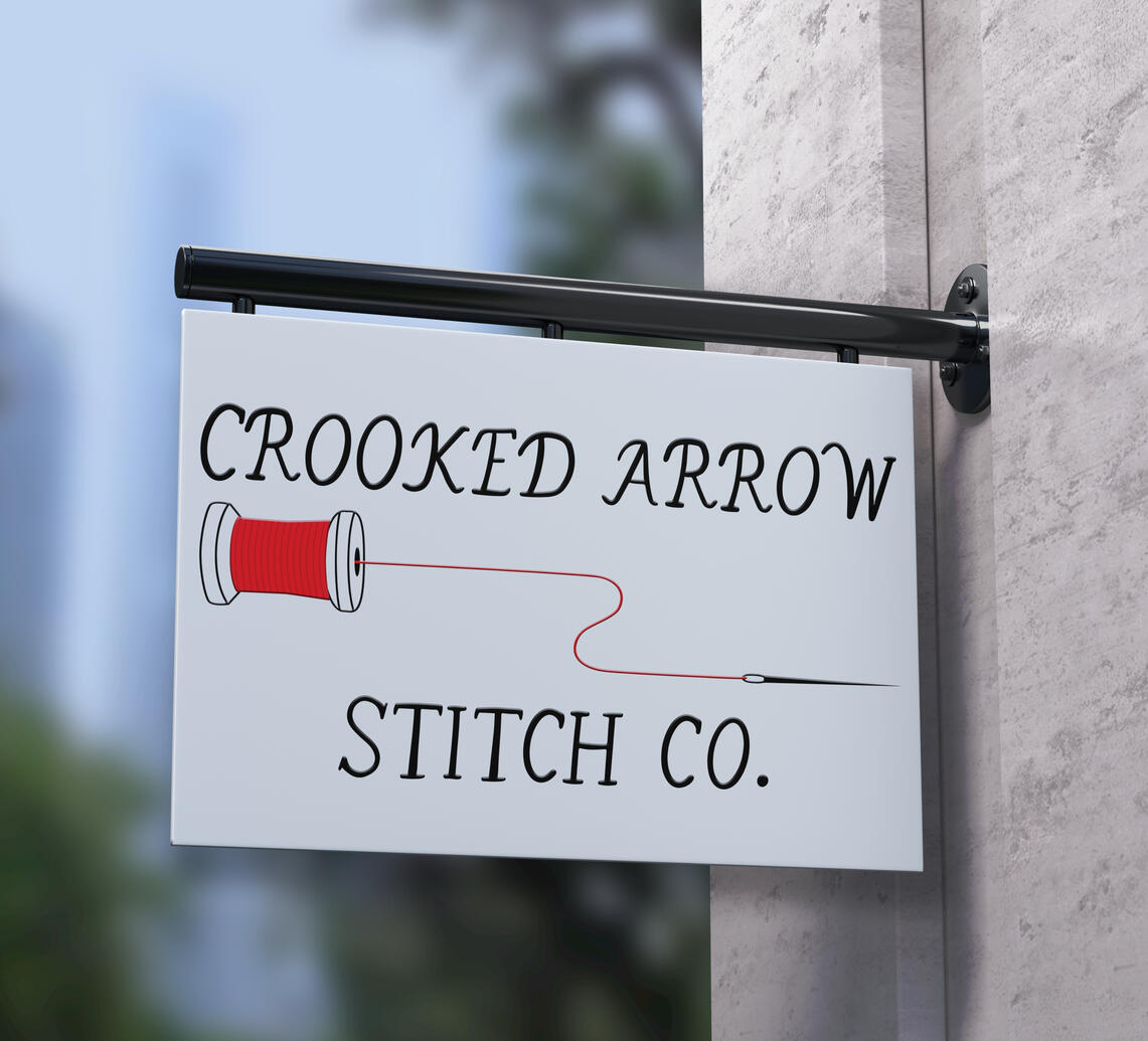
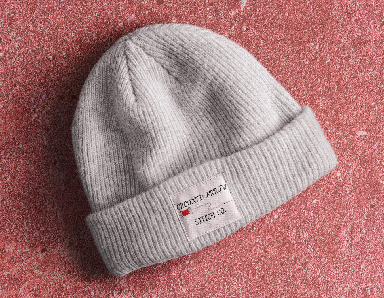
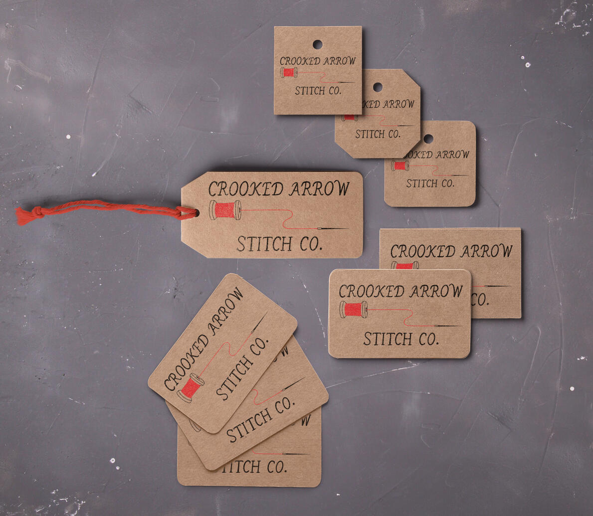
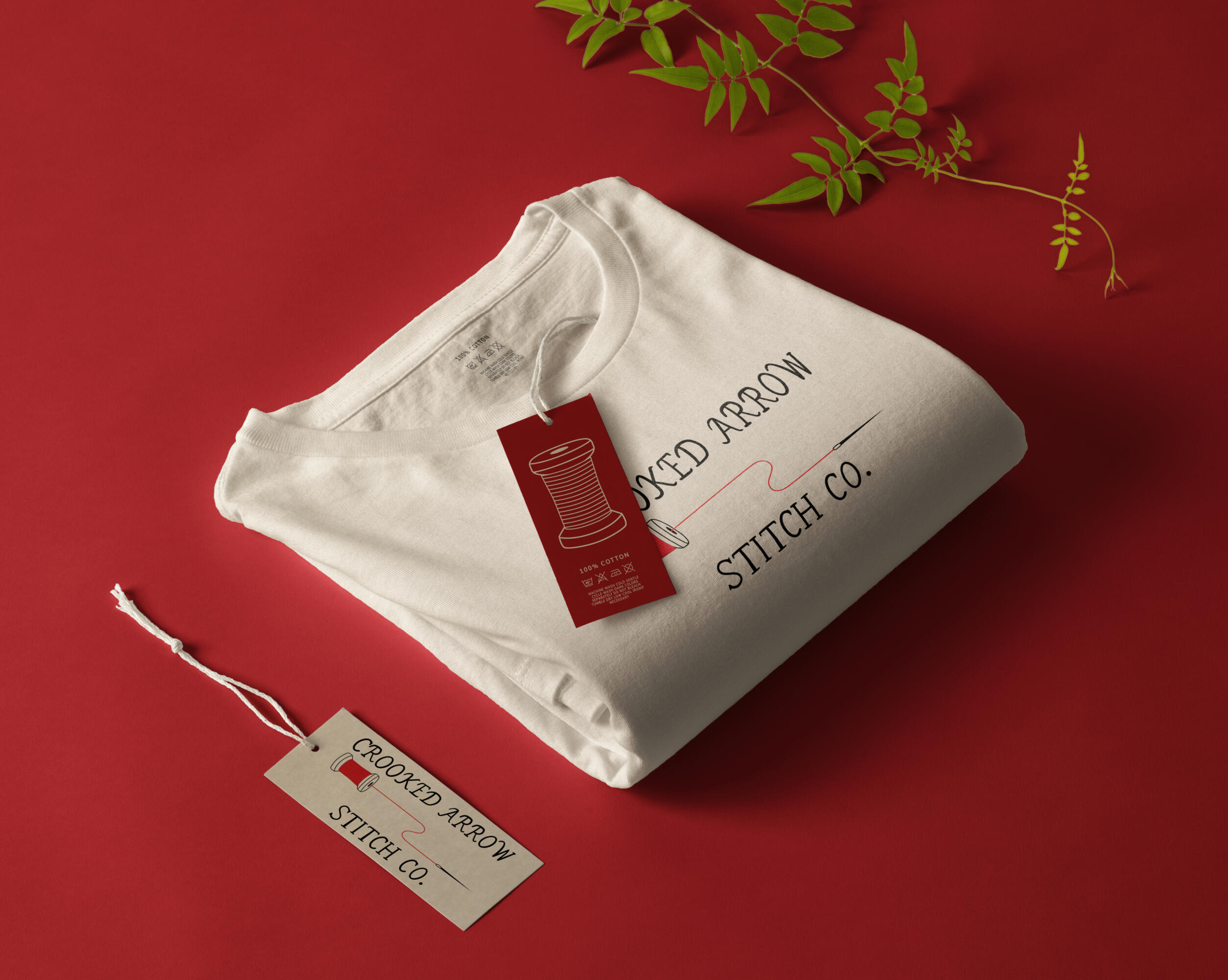
The visual elements are inspired from traditional sewing, embroidery, handmade textiles, and craftsmanship. A handwritten typeface gives the logo a personal, handcrafted quality, while simple graphic forms create a friendly and approachable aesthetic.The primary visual features a spool of red thread, directly representing the craft at the heart of the business.
The Process
The project began with research into embroidery and textile businesses. These influences helped establish a visual direction centered around personal nature of custom-made work.The red thread became an important accent in the logo, adding color and reinforcing the connection of hand stitching and embroidery.The final result is a warm and recognizable identity that highlights the handmade quality of the business.
© Aleesha Lindstrom 2020-2026 | All Rights Reserved